

Wizard
Kinetix ships a multi-step Wizard in two forms:
- a form layout component (
Wizard+Step) that breaks a form schema into steps, and - a standalone
<KinetixWizard>Vue component you can drop into any page — account setup, gated flows, anything — with shadcn variants and an optional completion gate middleware.
1. Wizard as a form layout
Inside a Form schema, wrap steps in a Wizard:
use Happones\Kinetix\Forms\Components\Wizard;
use Happones\Kinetix\Forms\Components\Step;
use Happones\Kinetix\Forms\Components\TextInput;

Wizard::make()
    ->variant('stepper') // stepper (default) | default | simple | vertical | panels | gradient
    ->fullWidth() // ->fullWidth(false) for a compact, centered indicator
    ->stepLayout('stacked') // inline (default) | stacked | tooltip — stepper variant, horizontal only
    ->steps([
        Step::make('Account')->schema([
            TextInput::make('email')->required(),
        ]),
        Step::make('Profile')->icon('user')->description('About you')->color('info')->schema([
            TextInput::make('name')->required(),
        ]),
    ])
Advancing is blocked until the required fields in the current step are filled (server-side validation still runs on submit). Fields across all steps are validated and saved like any other layout.
See §2 Step layout and §2 Per-step colors below for what stepLayout() and Step::color() do — they apply to both surfaces since the form layout renders through the same <KinetixWizard> core.
2. Standalone <KinetixWizard>
Use it in a page to drive a flow whose step content is whatever you want. Provide step metadata via :steps and step content via a slot named after each step's key (or the scoped default slot):
<script setup lang="ts">
import KinetixWizard from "@/components/kinetix/KinetixWizard.vue";

const steps = [
  { key: "plan", label: "Choose a plan", icon: "credit-card" },
  { key: "team", label: "Invite your team", icon: "user" },
  { key: "done", label: "Finish" },
];

function onFinish() {
  router.visit("/dashboard");
}
</script>

<template>
  <KinetixWizard :steps="steps" variant="gradient" @finish="onFinish">
    <template #plan> …plan picker… </template>
    <template #team> …team form… </template>
    <template #done> …summary… </template>
  </KinetixWizard>
</template>
Props
| Prop | Type | Default | Notes |
|---|---|---|---|
steps | KinetixWizardStep[] | — | { key?, label, description?, icon?, color? } |
variant | stepper | default | simple | vertical | panels | gradient | stepper | Step-indicator style |
orientation | horizontal | vertical | horizontal | Stepper orientation (the stepper variant) |
stepLayout | inline | stacked | tooltip | inline | How each step's indicator + label are arranged (stepper variant, horizontal only) |
fullWidth | boolean | true | Stretch the horizontal indicator to fill the container and distribute steps evenly. false = compact, centered, content-sized |
slug | string | null | null | When set, finishing marks completion server-side (gate) |
step | number | 0 | Controlled current step (v-model:step) |
linear | boolean | true | Restrict indicator jumps to reached steps |
beforeNext | (fromIndex) => boolean | Promise<boolean> | — | Return false / reject to block advancing (per-step validation) |
errorSteps | number[] | [] | Step indexes holding a validation error — their indicator is marked destructive, they stay navigable even under linear, and when new errors arrive the wizard auto-jumps to the first errored step (unless the current step already holds one) — the same contract as form Tabs. Set automatically for form wizards; see Forms → Error Focus |
Events & slots
- Events:
update:step,step-change,finish. - Slots:
#<step.key>(or scoped#default="{ step, index, stepKey }") for content;#actions="{ next, prev, finish, isFirst, isLast, busy, current }"to replace the Back/Next/Finish bar.
Variants
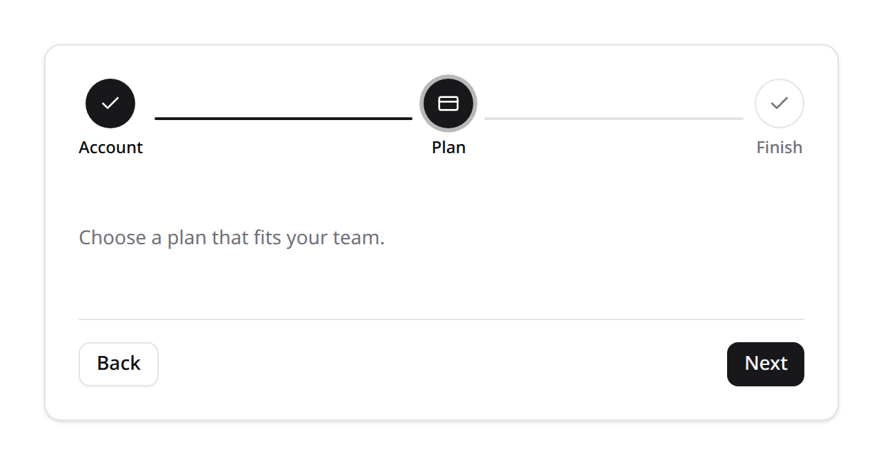
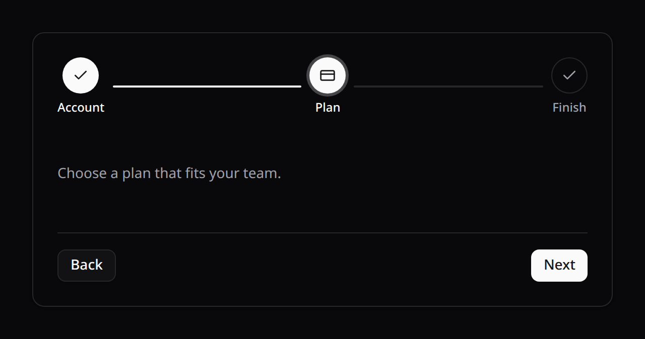
stepper (default) is the official shadcn/Reka Stepper — numbered indicators with titles, descriptions and connecting separators, built on reka-ui's Stepper primitives.
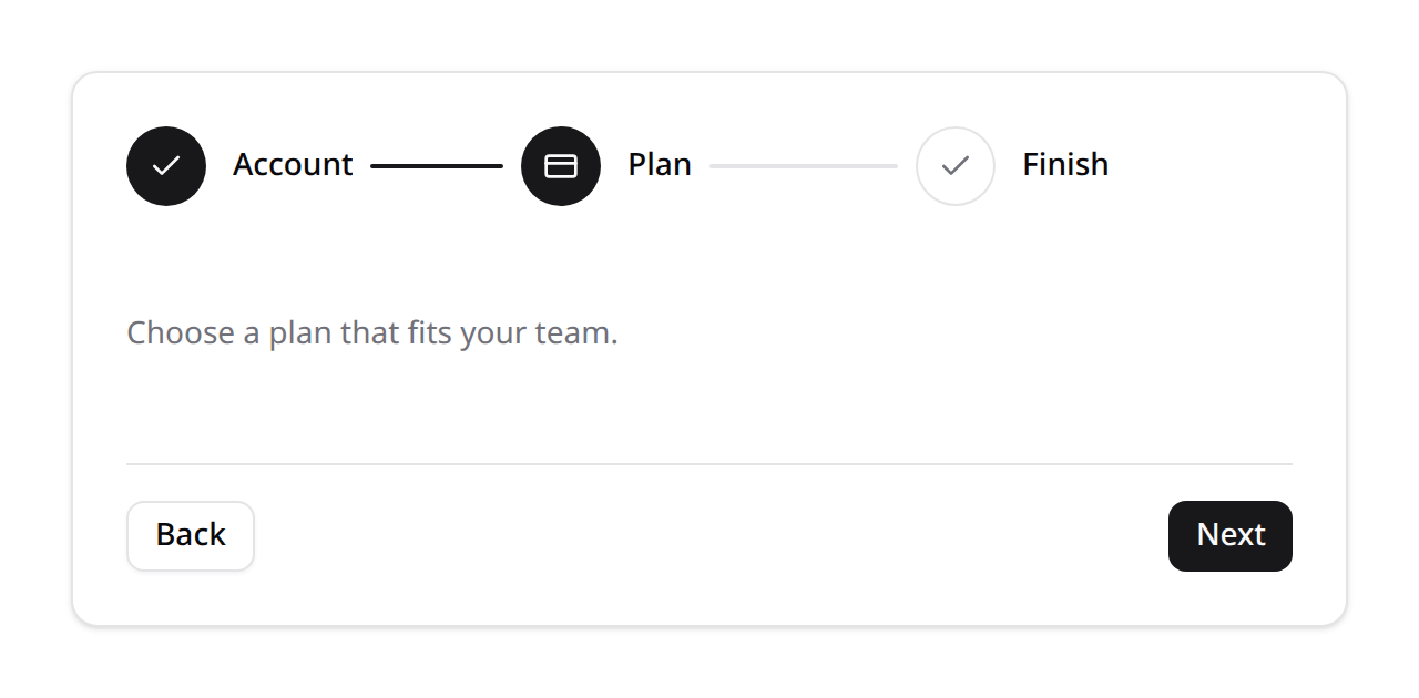
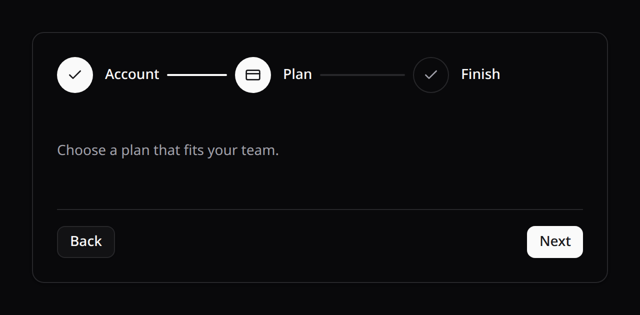
<KinetixWizard :steps="steps" />Set orientation="vertical" for a left-rail stepper (indicator + label side by side, one step per row):
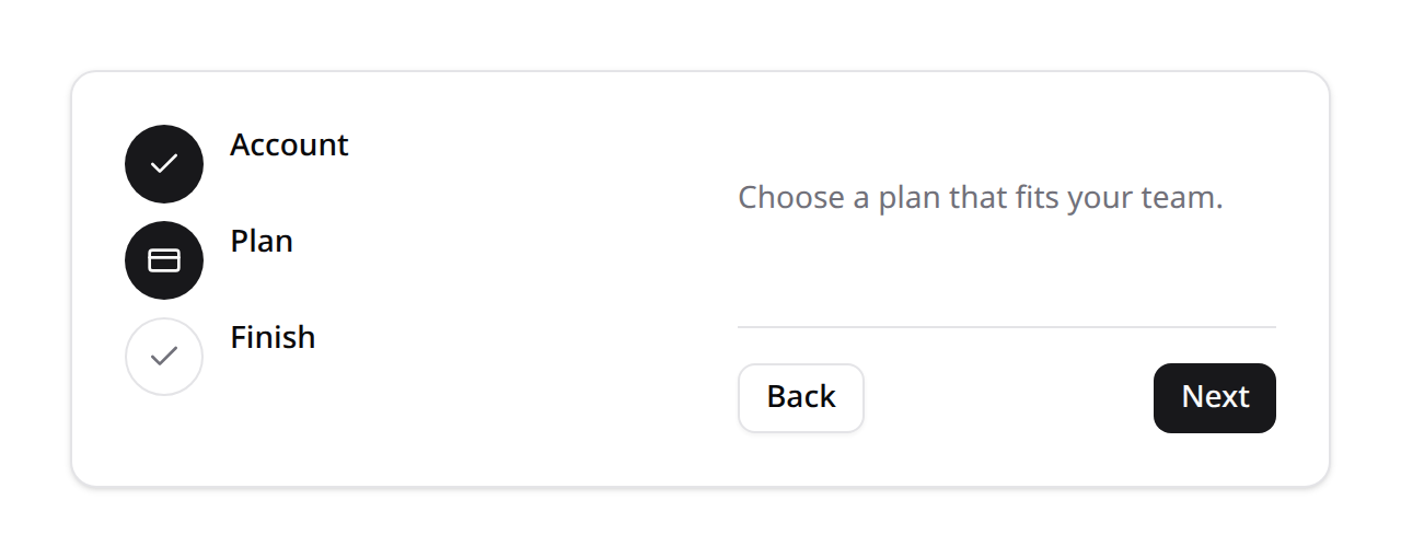
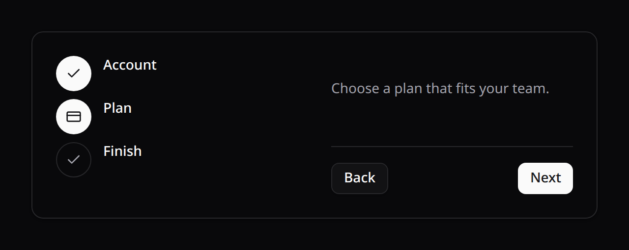
<KinetixWizard :steps="steps" orientation="vertical" />By default the horizontal indicator stretches to fill its container, spreading the steps evenly. Pass :full-width="false" (or ->fullWidth(false) on the PHP Wizard) for a compact indicator that sizes to its content and centers itself — handy when the form is narrower than the page:
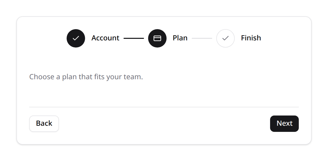
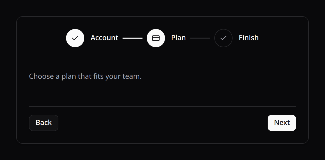
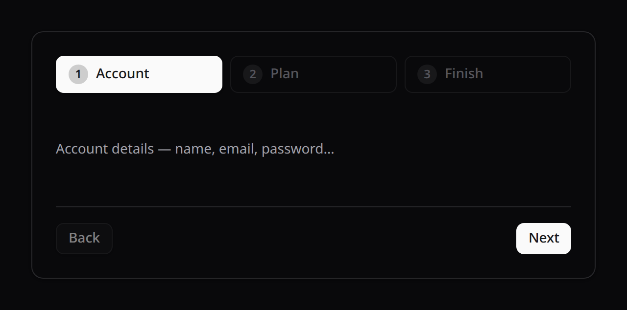
<KinetixWizard :steps="steps" :full-width="false" />The other designs — each a self-contained, differently-styled indicator (none support stepLayout or per-step color, see below):
<KinetixWizard :steps="steps" variant="default" />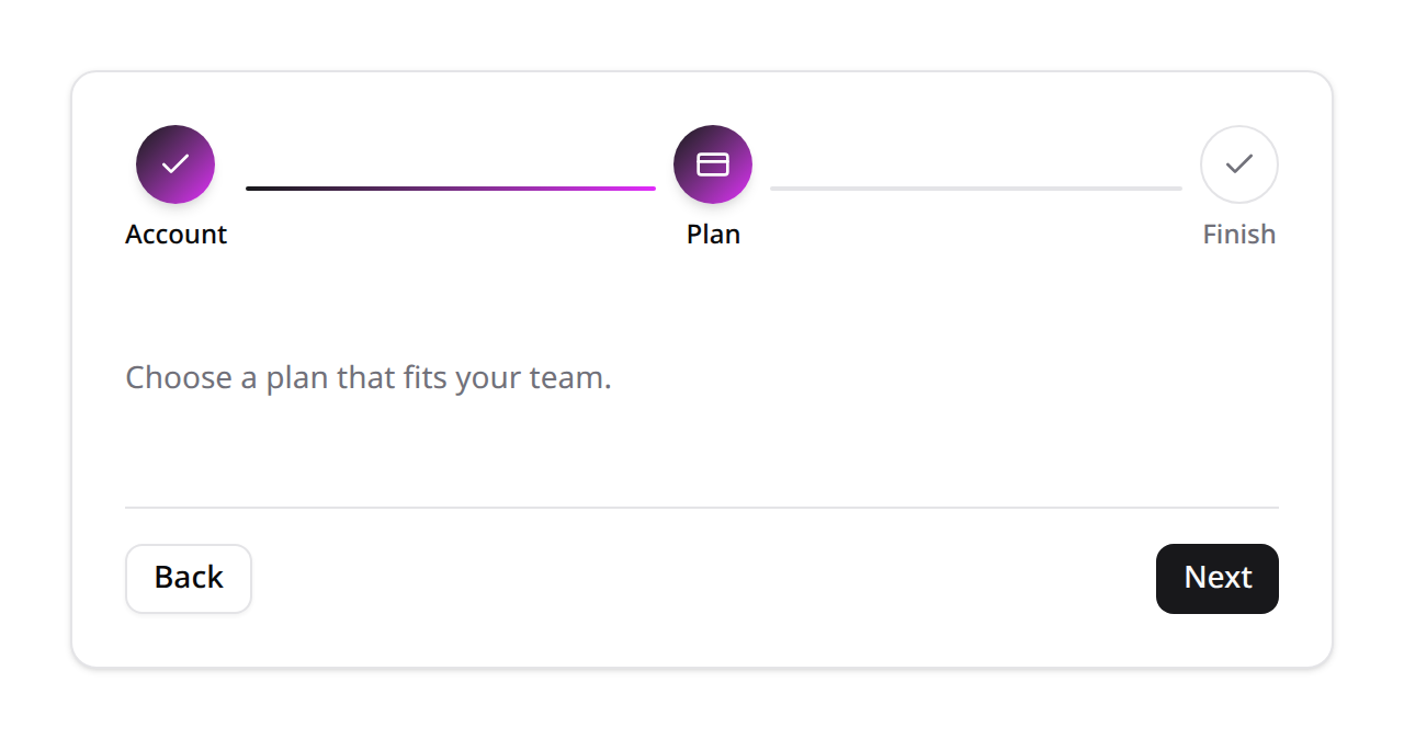
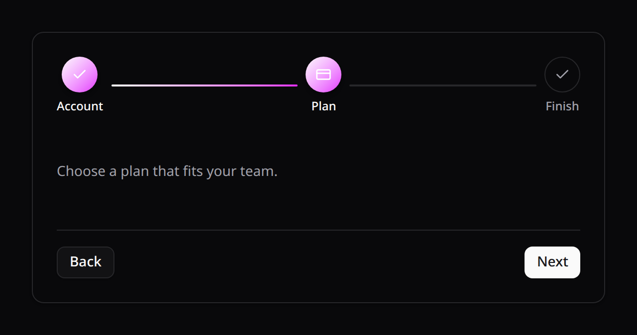
<KinetixWizard :steps="steps" variant="gradient" />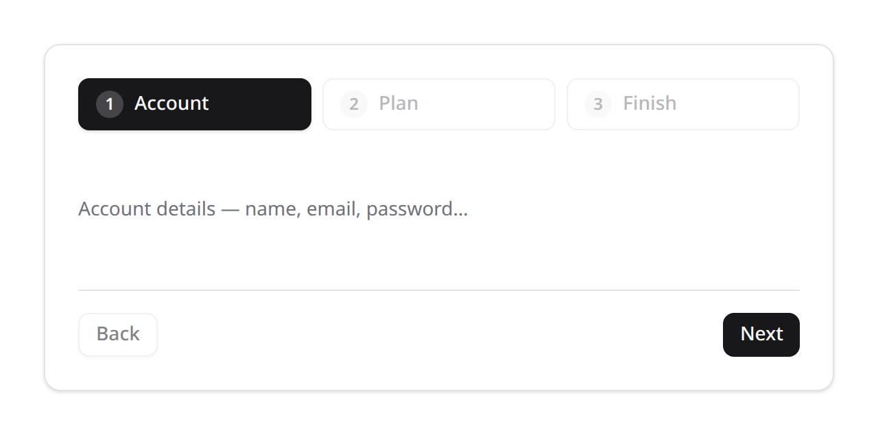
<KinetixWizard :steps="steps" variant="panels" />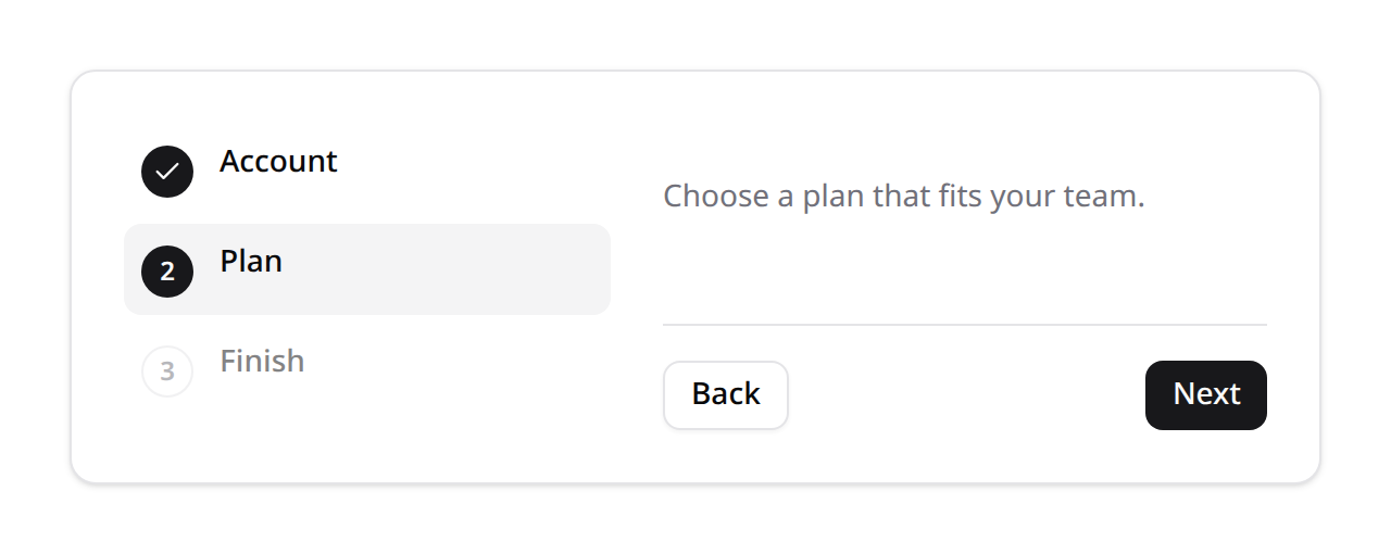
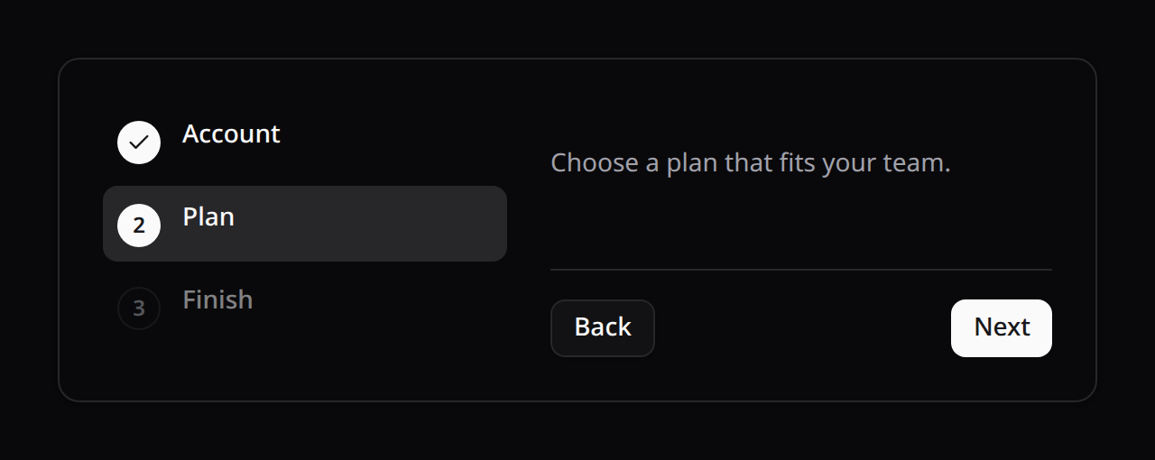
<KinetixWizard :steps="steps" variant="vertical" />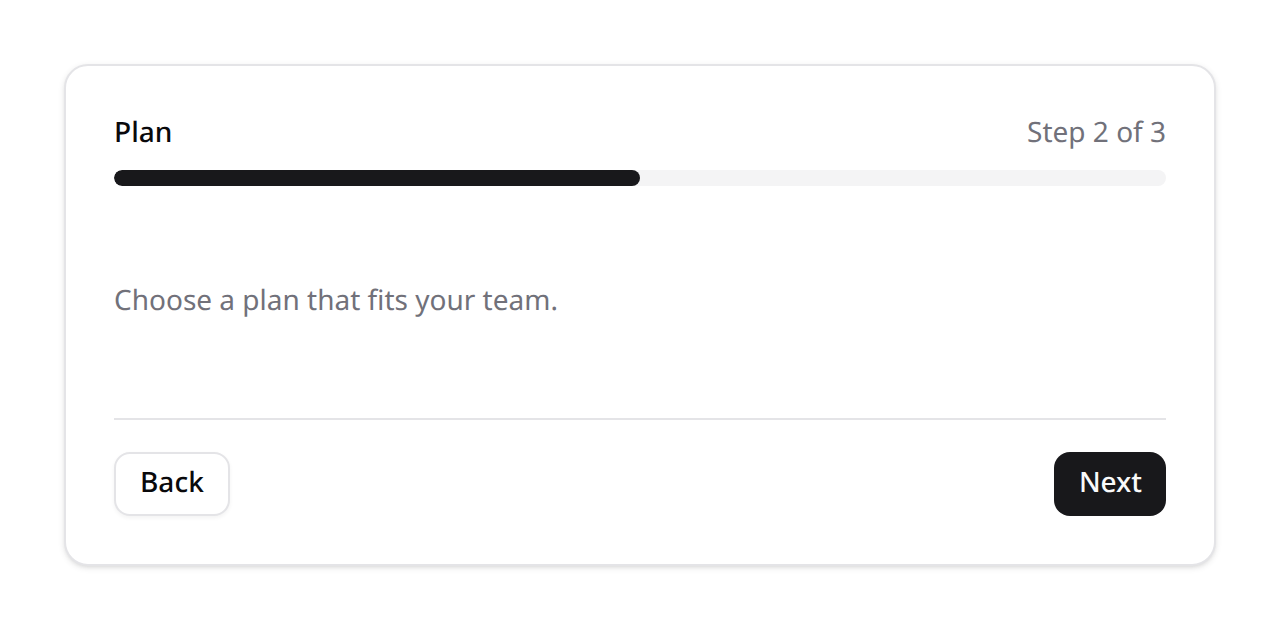
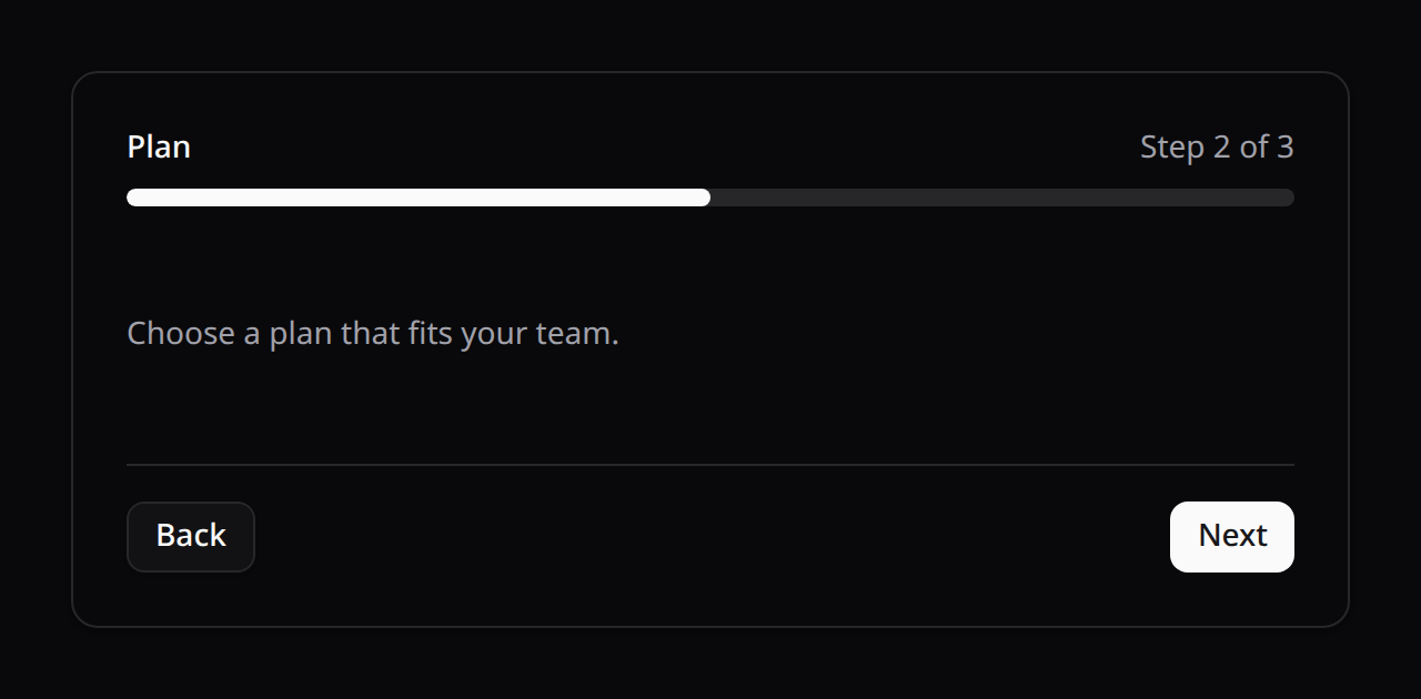
<KinetixWizard :steps="steps" variant="simple" />Step layout (stepper variant, horizontal)
stepLayout controls how each step's indicator and label are arranged — independent of variant/orientation/fullWidth/per-step color, so any combination works:
inline(default) — indicator + label side by side; the label is hidden below thesmbreakpoint (see the default screenshot above).stacked— indicator on top, label/description centered below, always visible (not hidden on mobile), truncated to one line each. Good when the label matters more than a side-by-side saving of vertical space.tooltip— indicator only; label/description are shown in a hover/focus tooltip instead. The most compact option — ideal for many steps (5-6+) on narrow viewports, since no label text is ever laid out inline. The label is still available to assistive tech viaaria-labelon the trigger.
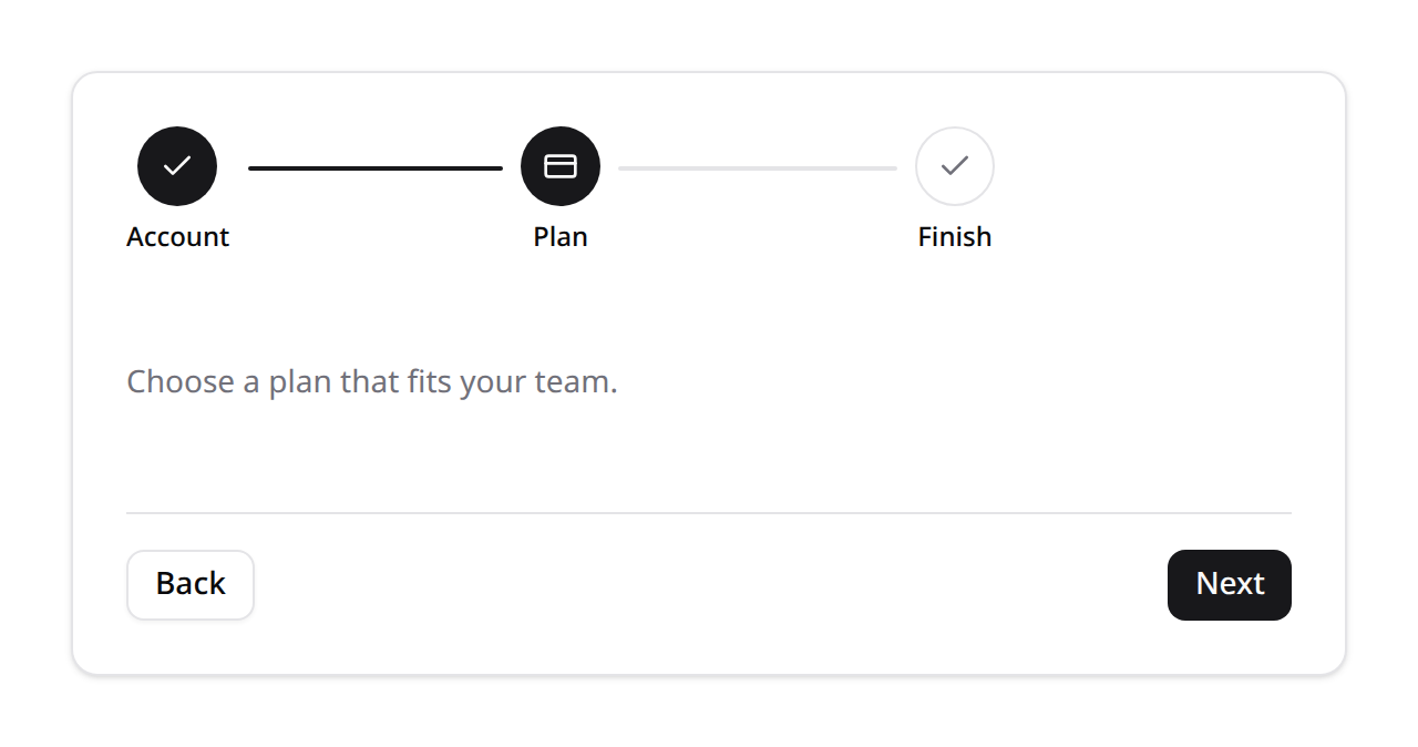
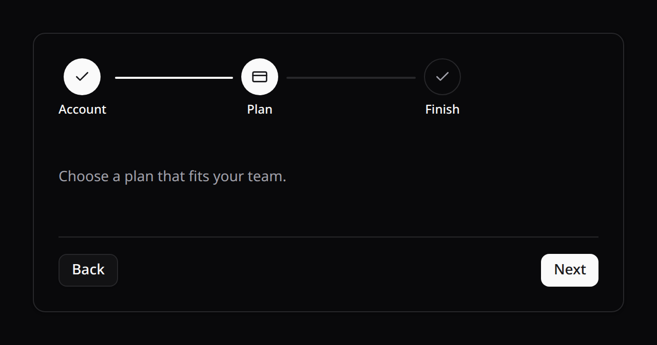
<KinetixWizard :steps="steps" step-layout="stacked" />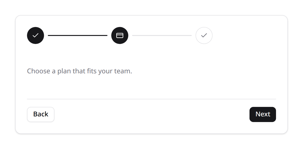
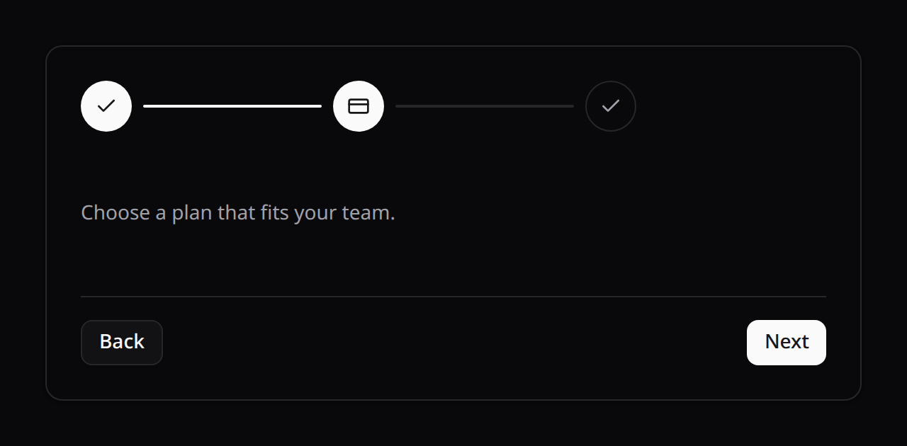
<KinetixWizard :steps="steps" step-layout="tooltip" />On the PHP form layout, set it once for the whole Wizard:
Wizard::make()->stepLayout('stacked')->steps([...]);Per-step colors (stepper variant)
Give an individual step its own accent color once it's active/complete — independent of stepLayout. Upcoming steps always stay neutral regardless of their configured color, so the accent only appears once the user reaches or passes that step:
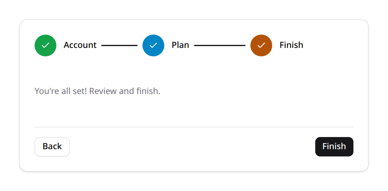
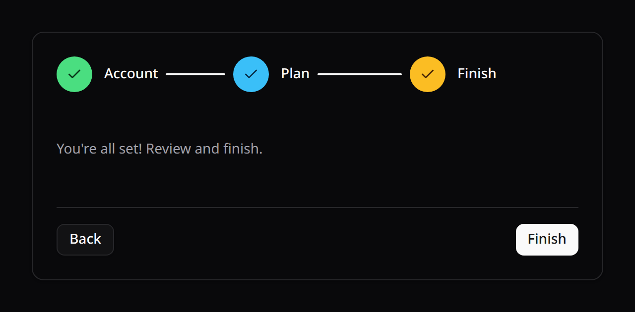
<script setup>
const steps = [
  { key: 'account', label: 'Account', icon: 'user', color: 'success' },
  { key: 'plan', label: 'Plan', icon: 'credit-card', color: 'info' },
  { key: 'done', label: 'Finish', icon: 'check', color: 'warning' },
];
</script>

<template>
  <KinetixWizard :steps="steps" />
</template>Wizard::make()->steps([
Step::make('Account')->icon('user')->color('success')->schema([...]),
Step::make('Plan')->icon('credit-card')->color('info')->schema([...]),
Step::make('Finish')->icon('check')->color('warning')->schema([...]),
]);Accepted colors: success · danger · warning · info · primary · gray (same tokens as everywhere else in Kinetix — Actions, badges, stat cards).
Overflow / responsive behavior
With many steps (5-6+) and/or long labels, the horizontal stepper indicator can need more width than the viewport has. Rather than breaking the page's layout, it scrolls internally (the indicator strip sits in its own scroll container), and step titles/descriptions truncate instead of forcing the row wider. This holds across every stepLayout and combination of fullWidth — tested at mobile (375px), tablet (768px) and desktop widths with 6 steps and realistic label lengths.
3. Gating routes until a wizard is completed
Make part of your app inaccessible until the user finishes a wizard.
1. Enable the module and map the wizard slug to the route hosting it:
// config/kinetix.php
'wizards' => [
    'enabled' => env('KINETIX_WIZARDS_ENABLED', true),
    'gates'   => [
        'account-setup' => 'account.setup', // route name to redirect to
    ],
],php artisan vendor:publish --tag=kinetix-wizards-migrations
php artisan migrate2. Apply the middleware to the routes you want gated:
Route::middleware(['auth', 'kinetix.wizard:account-setup'])->group(function () {
    Route::get('/dashboard', DashboardController::class)->name('dashboard');
});

// The wizard page itself — NOT gated (the middleware lets its own route through)
Route::get('/welcome', SetupController::class)->name('account.setup');
Until the user completes account-setup, every gated route redirects them to account.setup.
3. Finish the wizard with its slug so completion is persisted and the gate opens:
<KinetixWizard slug="account-setup" :steps="steps" @finish="router.visit('/dashboard')" />Completion is stored per user (or per user and team when kinetix.wizards.teams is on). The self-service endpoints are GET {prefix}/wizards/{slug} (status) and POST {prefix}/wizards/{slug}/complete. To re-run a wizard, call WizardManager::reset($user, $slug).
The page the user was going to is remembered, so the wizard's controller can send them back to it when it's done:
return redirect()->intended(route('dashboard'));A JSON request under a gated route gets a 409 with { wizard, url } instead of a redirect, and a wizard route under the team segment ({current_team}) gets the team being served.
A setup that must hold: team scope and your data
An account setup that a whole team depends on needs two more things: one member completes it for everyone, and finishing the wizard isn't enough — the information it collects must exist. Give the gate as an array:
// config/kinetix.php
'wizards' => [
    'gates' => [
        'account-setup' => [
            'route'     => 'account-setup',
            'scope'     => 'team',                               // once for the whole team
            'completed' => [App\Kinetix\AccountSetup::class, 'done'], // your data decides
        ],
    ],
],namespace App\Kinetix;
class AccountSetup
{
public static function done(User $user, int|string|null $teamKey): bool
{
return BusinessProfile::query()->where('team_id', $teamKey)->whereNotNull('completed_at')->exists();
}
}| Key | What it does |
|---|---|
route | Where gated routes send the user (the string form's value) |
scope | user (default): each user completes it. team: one member completes it for the team |
completed | A callable array (or invokable class) receiving the user and the team key. It decides completion from your data instead of a stored row, and the self-service complete endpoint then answers 403: the gate opens when the data is saved, never by asking |
A callable array keeps config:cache working; a closure in config doesn't.
With such a gate, don't give <KinetixWizard> the slug: finishing it would ask the complete endpoint, which refuses. Let its last step submit your form, and the gate opens once the controller saves the data.
All strings are localized (wizard_*, en/es/fr/pt).