

Kinetix Forms Complete Reference
Kinetix Forms is a schema-driven, DTO-powered form building system built specifically for Vue 3, Inertia.js 3, and Tailwind CSS. By defining form structures, layouts, validation, and lifecycles in PHP, you serialize configurations into structured JSON DTOs that are natively consumed by premium Vue 3 elements.
1. Core Architecture & Concept
Kinetix Forms decouples form configuration from layout rendering. Instead of writing verbose HTML templates with complex binding logic, you define the entire layout, validation rules, default states, and visibility settings in PHP.
Key Principles
- Declarative Layouts: Responsive columns, cards, and layouts are defined through a fluent API.
- TypeScript Generation: Serialized data structure maps to typescript types generated via Spatie's Laravel TypeScript Transformer.
- Tailwind JIT Compliance: Layout columns are computed using CSS custom properties or inline styles rather than dynamic Tailwind classes, avoiding purge and compilation errors.
- Unified Validation: Frontend validation errors map to standard Laravel Validator keybags, maintaining unified error rendering.
Defining a Form as a Class
As an alternative to the inline ->schema([...]) builder, subclass Form and override the buildSchema() hook. The hook runs in the constructor, so the schema is ready as soon as the form is instantiated.
use Happones\Kinetix\Forms\Form;
use Happones\Kinetix\Forms\Components\TextInput;

class ProfileForm extends Form
{
    protected function buildSchema(): array
    {
        return [
            TextInput::make('name')->required()->maxLength(100),
            TextInput::make('email')->email()->required(),
        ];
    }
}
Fields from a FormRequest
A FormRequest's rules already say a lot about its fields. Form::fromRequest() builds a form from them:
Form::fromRequest(StorePostRequest::class);          // create
Form::fromRequest(UpdatePostRequest::class, $post); // filled from the record| Rules | Field |
|---|---|
boolean | Toggle |
accepted | Checkbox |
in:a,b, Rule::in(), Rule::enum() | Select with those options |
array + name.* with in: | CheckboxList |
array:title,color | KeyValue with those keys |
array | TagsInput |
json | JsonInput |
timezone | TimezoneSelect |
date, date_format, before/after | DatePicker; DateTimePicker when the format has a time or the name ends in _at |
integer, numeric, decimal | NumberField, with min/max |
file, image, mimes, File::image() | FileUpload (image(), multiple() for an array) |
email, url, password/Password::… | TextInput of that kind |
max: over 255 | Textarea |
| anything else | TextInput |
required (unless sometimes), max/min and the request's attributes() labels carry over, and confirmed adds the _confirmation field. Nested rules (items.*.qty) and fields that are prohibited or exclude are left out.
The rules say what to validate, not how to ask for it, so this is a start. A relation id (exists:users,id) is a plain input, not a select. The rules are read with the current request rather than the route they belong to, so rules that need the route's model ($this->post->id) can't be read; Kinetix throws and asks for a Form class.
To shape the form yourself, write the guess into a class and edit it:
php artisan kinetix:make-form PostForm --from-request="App\Http\Requests\StorePostRequest"A relation id gets a comment suggesting a Select with ->relationship().
One-Call Rendering
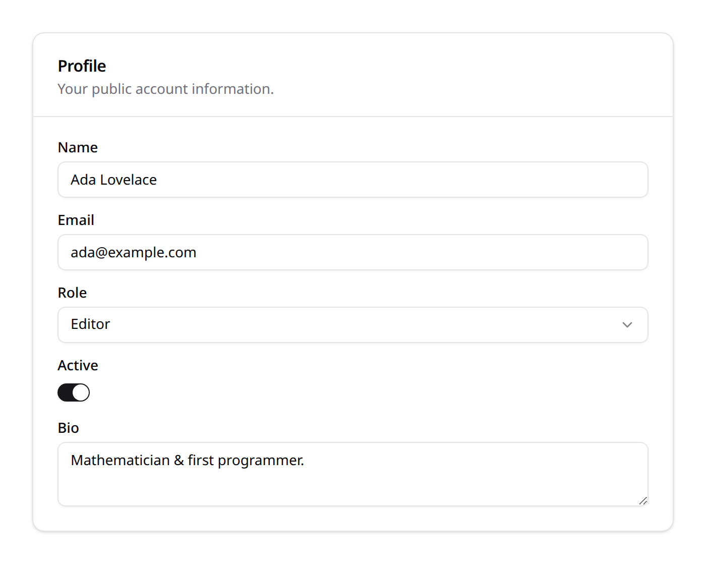
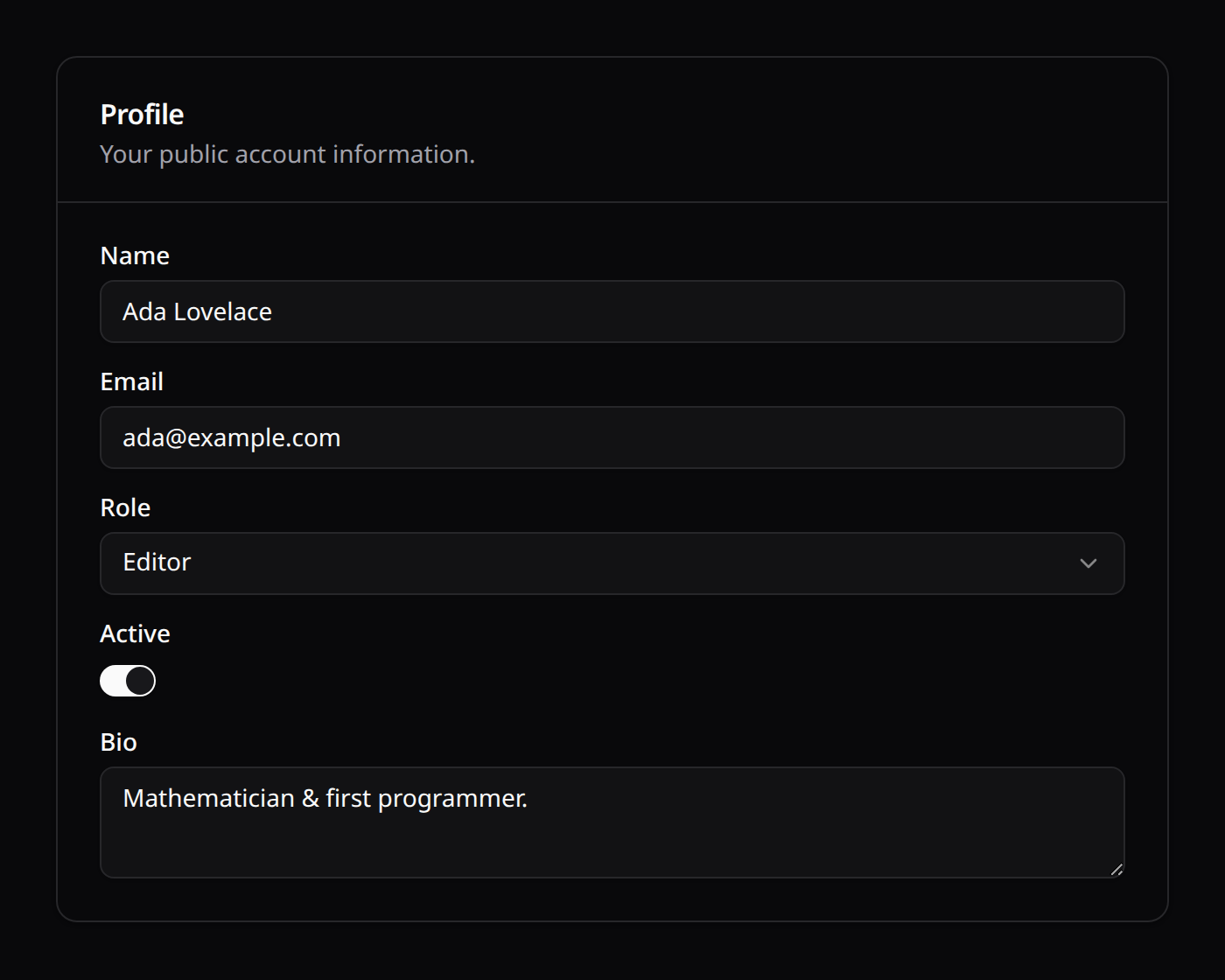
Form::render(?Model $record = null) is a static helper that instantiates the form, fills it (from the passed model, or the given fill data), and returns the serialized array in one call:
return inertia('Settings/Profile', [
    'profileForm' => ProfileForm::render($user),
]);
2. Forms Lifecycle & State Management
Form fields follow a strict lifecycle of data transformation during hydration (filling the form) and dehydration (extracting submitted state).
1. Hydration
Hydration extracts properties from a model or an array and binds them to the corresponding form fields. This occurs when you call $form->fill($data).
Hydration Callbacks
afterStateHydrated(Closure $callback): Executed immediately after a field is populated. The closure receives the raw state value, the field component instance, and the source record (if a Model was passed):phpTextInput::make('username') ->afterStateHydrated(function (mixed $state, Field $component, ?Model $record) { $component->default(strtolower((string) $state)); });afterStateUpdated(Closure $callback): Executed when the field's value changes on the client. Combine withlive(bool $onBlur = false, ?int $debounce = null)to make the field reactive (push updates on change / blur / debounced):phpTextInput::make('first_name') ->live(debounce: 500) ->afterStateUpdated(function (mixed $state, Field $component) { // react to the new value });
Copyable & revealable inputs
copyable(bool $condition = true): adds a click-to-copy button that copies the field's value to the clipboard.revealable(bool $condition = true): masks the value (password-style) with a toggle to reveal it — ideal for API keys, tokens and secrets. Combine the two for a copyable secret field:phpTextInput::make('api_key') ->revealable() ->copyable();
2. Dehydration
Dehydration processes user inputs, validates them, and transforms the states into database-compatible formats when you call $form->getState($requestData).
Dehydration Callbacks
dehydrateStateUsing(Closure $callback): Transforms the submitted value before it is returned in the final state array:phpTextInput::make('slug') ->dehydrateStateUsing(fn (string $state): string => str($state)->slug()->toString());saved(bool $condition): Instructs the form whether to include the field's value in the output of$form->getState(). For example, presentational helper inputs (like passwords confirmations) should be validated but omitted:phpTextInput::make('password_confirmation') ->password() ->saved(false); // Validated on request, but excluded from database update payloads
3. Form Layouts & Containers
Layout elements organize fields inside grids and visual groupings. They inherit column spans and conditional visibility parameters.
1. Grid
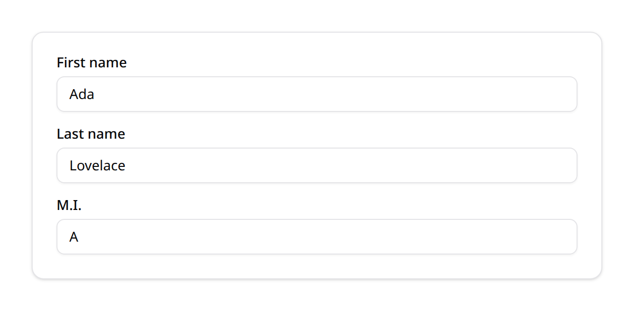
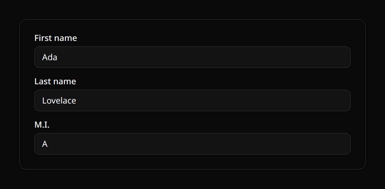
The Grid component creates a multi-column layout. It defaults to 2 columns, and a field spans 1 — so two fields sit side by side with no annotation:
use Happones\Kinetix\Forms\Components\Grid;
use Happones\Kinetix\Forms\Components\TextInput;

Grid::make()
    ->schema([
        TextInput::make('first_name'),   // 50%
        TextInput::make('last_name'),    // 50%
    ])
Pass a column count for anything else. A 12-column grid gives the finest control:
Grid::make(12)
    ->schema([
        TextInput::make('street')->columnSpan(8),
        TextInput::make('number')->columnSpan(4),
    ])
Defaults changed in v0.128.0
The form root is now a 1-column grid and a field's default columnSpan is 1 (it was a 12-column root with columnSpan: 'full'). Plain fields still render full width, and explicit spans inside an explicit Grid::make(12) are unchanged — but a field with no span inside a Grid::make(12) used to fill the row and now takes 1/12. Add ->columnSpanFull() to those, or drop the 12 and let the new default do the work.
Responsive columns & spans
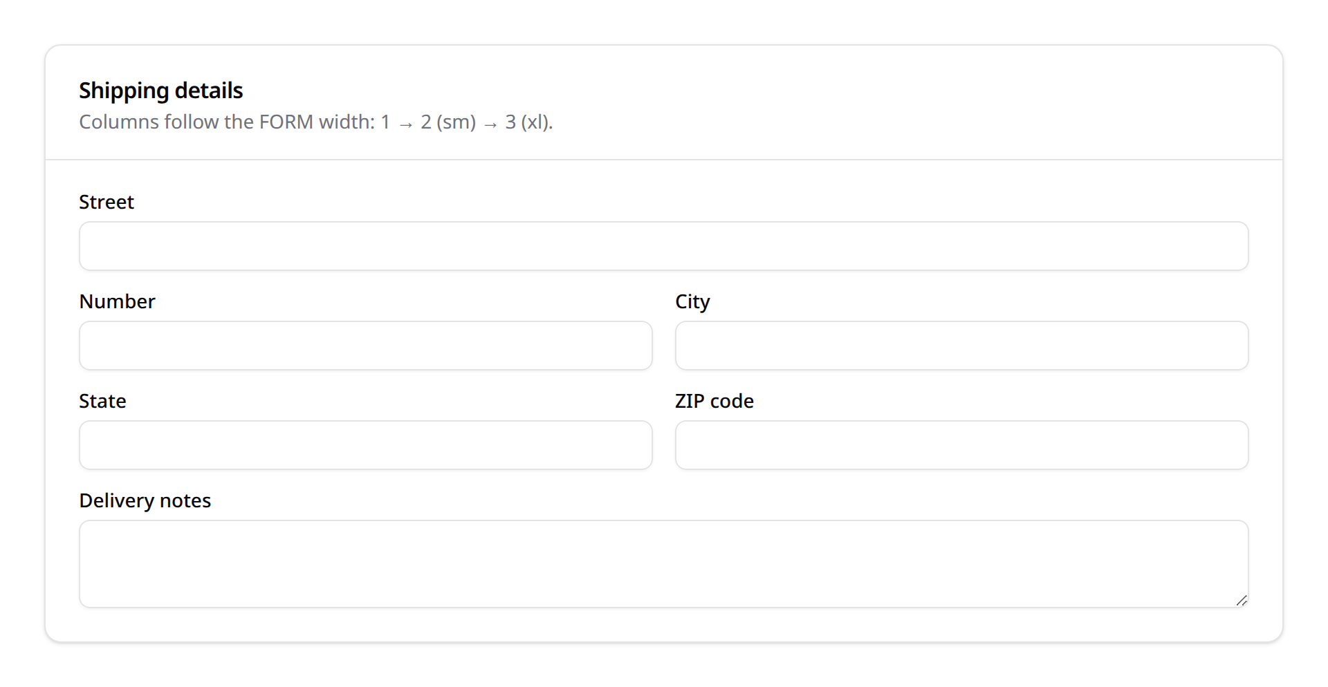
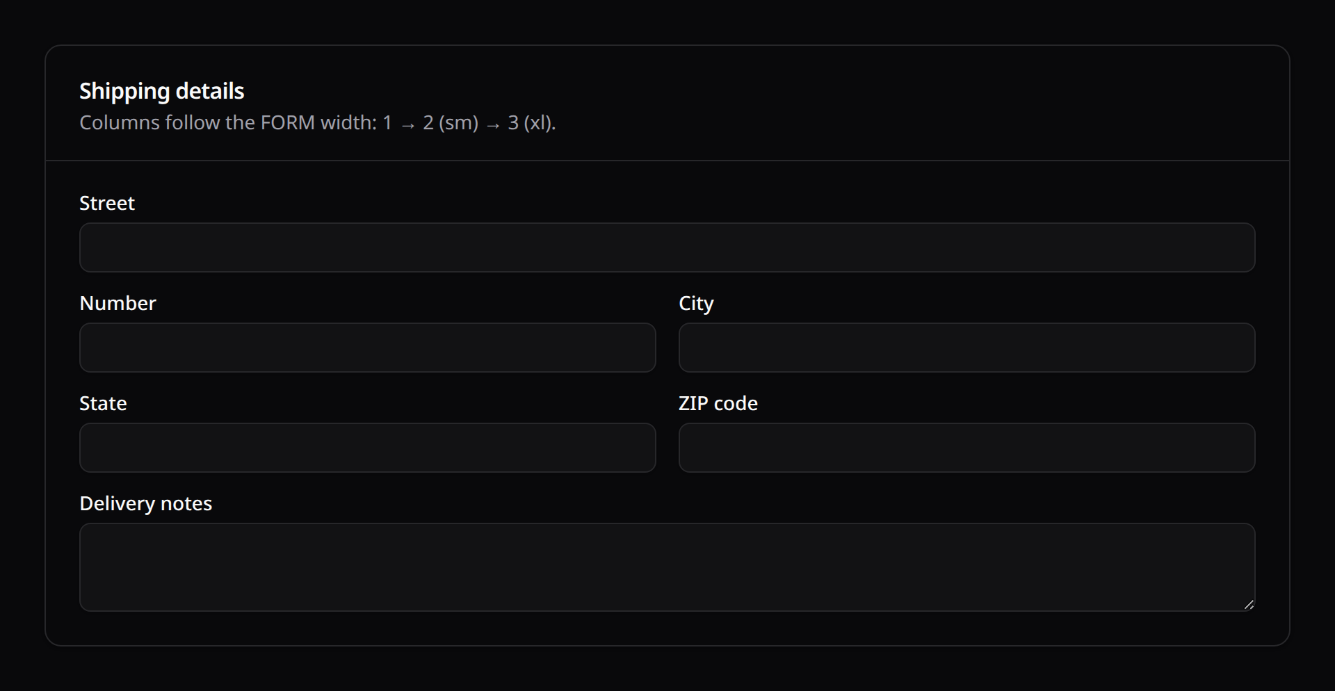
Grids are responsive by default: an int means "this many columns from lg up, one below", so Grid::make(2) collapses to a single column on narrow layouts with no annotation. Breakpoints are measured against the form's own width (CSS container queries), not the viewport — a two-column form inside a narrow modal or side pane collapses too.
Both columns() and columnSpan() also take a breakpoint map (default · sm 640 · md 768 · lg 1024 · xl 1280 · 2xl 1536); values carry forward through unspecified breakpoints, and spans are clamped to the columns available at each size so they can never overflow the grid:
Section::make('Shipping')
    ->columns(['default' => 1, 'sm' => 2, 'xl' => 3])
    ->schema([
        TextInput::make('street')->columnSpan(['sm' => 2]),
        TextInput::make('number'),
        Textarea::make('notes')->columnSpanFull(),
    ]);
columns() accepts maps on Grid, Section, Fieldset, Tab and wizard Step alike.
Tailwind Grid-Purge Prevention
To ensure column layouts render correctly without depending on dynamic Tailwind compiler classes (which JIT compilers purge), Kinetix evaluates columns / columnSpan parameters into inline CSS variables consumed by static @container rules:
columnSpan(int): spans X columns at every size (clamped per breakpoint).columnSpan('full')/columnSpanFull(): spans the whole row.columnSpan([...])/columns([...]): per-breakpoint values.
2. Section Cards
The Section component wraps nested elements in a clean visual container complete with title, description, and column layouts.
use Happones\Kinetix\Forms\Components\Section;

Section::make('General Profile')
    ->description('Enter your public accounts info.')
    ->columns(2) // Sections are single-column until told otherwise
    ->schema([
        TextInput::make('display_name'),
        TextInput::make('twitter_handle'),
    ])
Sections inside modals: pass flat
The Section card is designed for pages, where the schema provides its own surface. When a form renders inside a KinetixModal/KinetixSheet, pass the flat prop to <KinetixForm> — the panel is already the surface, so Sections drop their card chrome (border/shadow/background) and render as divided groups with their heading and description intact, instead of nesting a card inside the modal. Kinetix's own modal hosts (the simple-resource record modals, relation-manager attach forms, and view-modal infolists) do this automatically.
<KinetixModal :open="open" title="New event" scroll-body>
    <KinetixForm :form="eventForm" flat @submit="submit" />
</KinetixModal>
Submitted from outside: id and hide-submit
A page footer, a header or a modal's footer can own the Save button. Give the form an id and the action ->submits('that-id') (Actions); hide-submit drops the form's own button so there's only one:
<KinetixForm id="adjust-stock" :form="form" hide-submit @submit="save" />Long forms in a modal: scroll-body is a layout choice, not a rescue
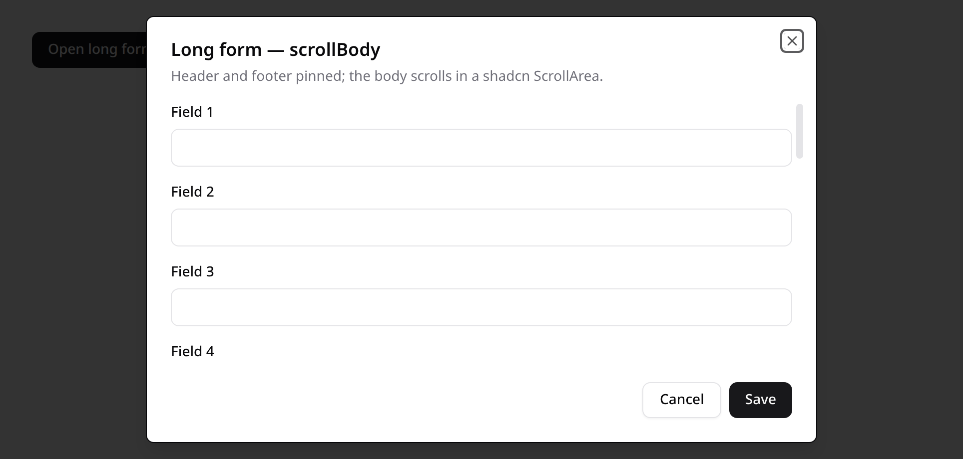
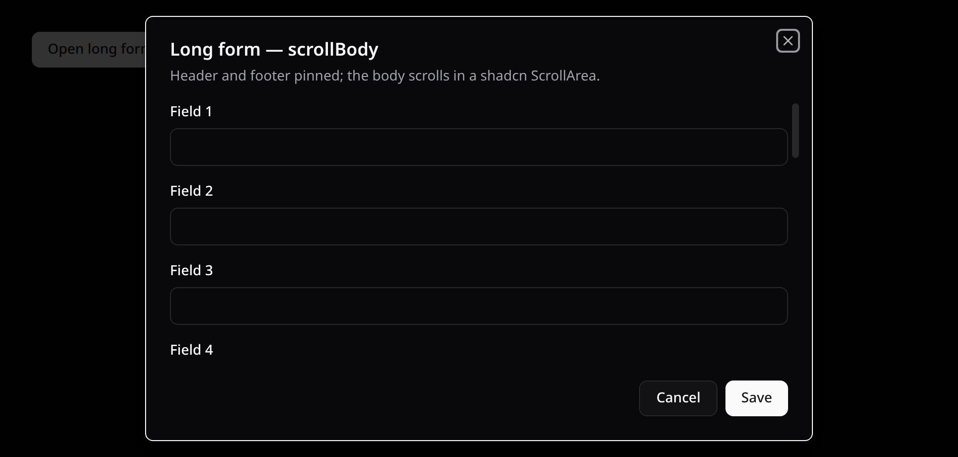
The shell bounds itself. A panel taller than the viewport scrolls inside the dialog wrapper, so a long form never strands its first field or its footer actions off screen — with or without scroll-body.
Pass scroll-body when you want the other layout: header and footer pinned while only the body scrolls (in a shadcn ScrollArea), so Save and Cancel stay visible the whole way down. Skip it when the body hosts a dropdown that renders in flow and must escape the panel — a scrolling body clips it. KinetixSheet always uses the pinned layout.
Forms sit near the top: placement="top"
A shadcn dialog is vertically centered, which is right for a confirmation but awkward for a form you work in: a centered panel grows in both directions, so every height change — the loading skeleton giving way to the fields, a validation error appearing, a conditional field revealing itself — re-centers the panel and moves the title and the field under your cursor. Anchored to the top it only grows downward.
Pass placement="top" to anchor the panel 10vh from the top on sm and up (mobile stays centered, the keyboard owns that layout). Kinetix's record modals — create / edit / view in tables, simple resources and relation managers, the relation-manager attach picker, the role editor and the announcement form — use it by default; short dialogs (confirmations, deletes) stay centered. With scroll-body the panel's height budget shrinks by the same offset, so the pinned footer never drops below the fold.
<KinetixModal :open="open" title="New event" scroll-body placement="top">
    <KinetixForm :form="eventForm" flat @submit="submit" />
</KinetixModal>
3. Fieldset
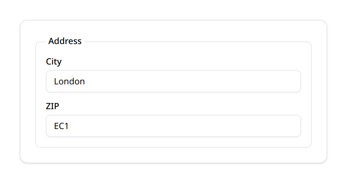
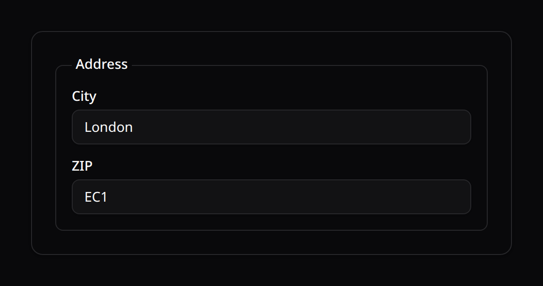
A lighter labelled grouping than Section — a bordered <fieldset> with a <legend>, no card chrome. Supports columns() and nesting.
use Happones\Kinetix\Forms\Components\Fieldset;

Fieldset::make('Address')
    ->columns(6)
    ->schema([
        TextInput::make('city')->columnSpan(4),
        TextInput::make('zip')->columnSpan(2),
    ])
4. Tabs
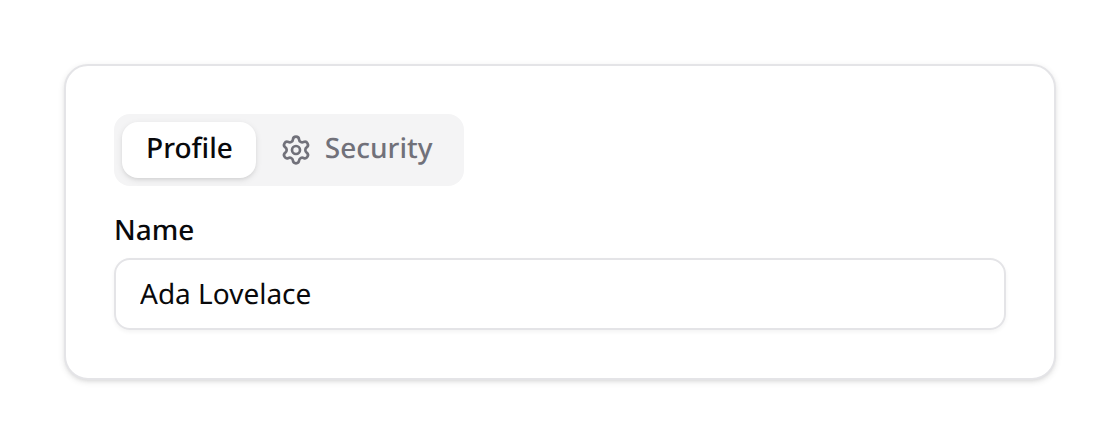
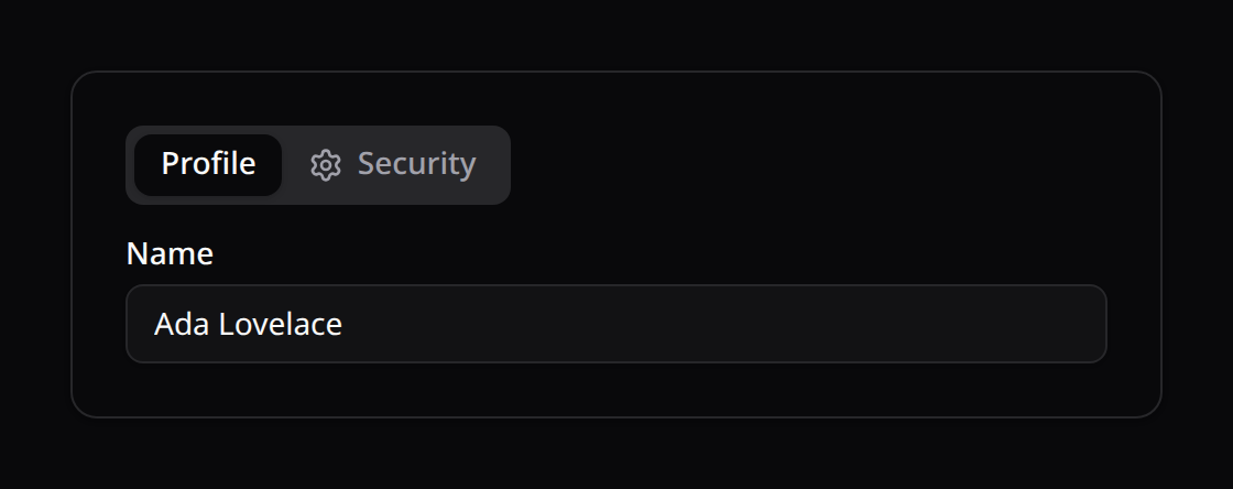
A tabbed container (Reka UI). Each Tab holds its own schema and may carry an icon() (any Kinetix icon name). Fields inside every tab are still validated and saved — switching tabs is purely visual.
use Happones\Kinetix\Forms\Components\Tabs;
use Happones\Kinetix\Forms\Components\Tab;

Tabs::make()->tabs([
    Tab::make('Profile')->schema([
        TextInput::make('name'),
    ]),
    Tab::make('Security')->icon('settings')->schema([
        TextInput::make('password'),
    ]),
])
5. Split
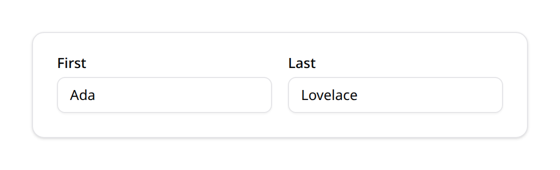
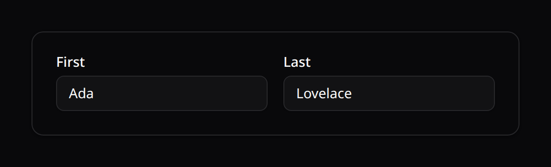
A responsive flex row: children sit side-by-side from the md breakpoint and stack on small screens.
use Happones\Kinetix\Forms\Components\Split;

Split::make([
    TextInput::make('first_name'),
    TextInput::make('last_name'),
])
6. Placeholder
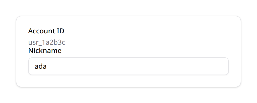
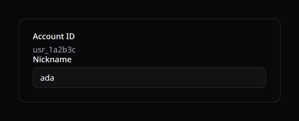
A read-only display block (label + content). It holds no field state and is never validated or saved — handy for showing computed/derived info inside a form.
use Happones\Kinetix\Forms\Components\Placeholder;

Placeholder::make('Account ID')
    ->content(fn ($record) => $record?->id ?? '—')
All layout components share the base columnSpan(), visible()/hidden(), visibleOn()/hiddenOn(), and authorize() methods (see §5 Operations & Visibility Constraints), and nest arbitrarily.
7. Wizard
Break a form into validated steps with Wizard::make()->steps([Step::make(...)]). Advancing is gated on the current step's required fields. Also available as a standalone page component with gating middleware — see the dedicated Wizard guide.
use Happones\Kinetix\Forms\Components\Wizard;
use Happones\Kinetix\Forms\Components\Step;

Wizard::make()
    ->variant('gradient')
    ->steps([
        Step::make('Account')->schema([TextInput::make('email')->required()]),
        Step::make('Profile')->icon('user')->schema([TextInput::make('name')]),
    ])
4. Fields & Form Inputs API
What the rules ask for, before the server
A field's validation rules show up in the form itself, so the user learns what a value needs before submitting it:
TextInput::make('code')->rules(['alpha_dash', 'lowercase', 'max:20']),
NumberField::make('max_price')->rules(['numeric', 'gte:min_price']),
TextInput::make('password')->password()->rules([Password::min(10)->mixedCase()->numbers()]),
TextInput::make('password_confirmation')->password()->rules(['same:password']),- Hints under the field say what the rules ask, in the user's language: "Letters, numbers, dashes and underscores", "Between 1 and 100", "At least Min price", "PNG, JPG · Up to 2 MB · At least 800×600 px", a password policy's parts.
- A counter (
12/20) shows a capped length. It reads the limit aloud only near it, and never stops the typing: pasted text isn't cut silently. - Checks when the user leaves the field, then live while they fix it. The message is the requirement the value misses, so it says what to do. A server or Precognition error wins; an empty field is left to the server.
- Comparisons with other fields (
gt,gte,lt,lte,same,different,after:start_date) use their current values, and a confirmation that matches says so. - Dedicated inputs where a rule calls for one:
- A password field (
->password()) has a show/hide toggle. With aPasswordrule, the policy is a checklist that ticks off as the user types, with a strength meter. - A code (
ip,ipv4,ipv6,mac_address,uuid,ulid,hex_color) is shown in a monospace font, with a tick once it's well formed. - A date picker can't pick what
after/before/date_equalsrefuse, including bounds set by another field (before:ends_on). - A file upload checks types, size and dimensions before sending (FileUpload).
- A password field (
- The right keyboard and no autocorrect: numbers open the number pad,
email/urltheir keyboards, and codes (alpha_dash,uuid,ip,lowercase, …) turn off autocapitalization and spellcheck.lowercaseanduppercaseconvert the text as it's typed. - Conditional rules become live conditions:
required_if:type,company,required_unless,required_with:fieldandrequired_without:fieldmake the field required as the form changes;exclude_if,exclude_unlessandprohibited_ifhide it. A condition you set yourself (requiredWhen()) wins.
| Rule family | In the form |
|---|---|
min/max/size/between | length (text), value (numbers), count (lists), size (files) |
integer, decimal, multiple_of, digits, digits_between | hint and check |
alpha, alpha_num, alpha_dash, ascii, lowercase, uppercase | hint and check |
starts_with, ends_with, doesnt_start_with, doesnt_end_with, not_in | hint and check |
email, url, ip, ipv4, ipv6, mac_address, uuid, ulid, hex_color, json, timezone | hint (an example) and check |
regex, not_regex | check, when the pattern translates to JavaScript |
after, after_or_equal, before, before_or_equal, date_equals | hint and check, against a date, today/tomorrow or another field |
gt, gte, lt, lte, same, different | hint and check against another field |
distinct | hint and check |
Password::min()->letters()->mixedCase()->numbers()->symbols() | one hint per part, each checked; uncompromised() is checked on save |
mimes, extensions, mimetypes, image, File::types(), dimensions | one summary hint |
The server validates everything again: these checks are a guide, loose where the exact rule is the server's (email, url), and rules that need the database (unique, exists) or run your code (closures, custom rule objects) are only checked there. A form built from a FormRequest (fields from a FormRequest) carries the request's rules, so its hints follow them too.
Fields reside in the Happones\Kinetix\Forms\Components namespace. They all inherit from the base Field class, providing rich configuration options:
Shared Field Methods
label(string|Closure $label): Customizes field title. If omitted, Kinetix translates the column name into a TitleCase Headline. Wrap an explicit label in__()to keep it translatable —->label(__('posts.fields.title'))(see Localizing labels).default(mixed $value|Closure $value): Set initial fallback state.disabled(bool|Closure $condition = true): Prevent input mutations.placeholder(string|Closure $placeholder): Visual watermark.helperText(string|Closure $text): Hint rendered under the field. Wired for assistive tech: it gets an addressable id ({name}-help) and the control'saria-describedbychains it together with any validation error ({name}-help {name}-error), so screen readers hear both.prefix(string|Closure $prefix): Prepends a label prefix.suffix(string|Closure $suffix): Appends a label suffix.extraInputAttributes(array $attributes): Custom HTML attributes merged onto the input element.extraAttributes(array $attributes): Custom HTML attributes merged onto the field's outer container.extraFieldWrapperAttributes(array $attributes): Custom HTML attributes merged onto the field wrapper (label + control group).
Conditional fields
Show, hide, require or disable a field based on another field's live value — evaluated client-side (no round-trip) and enforced again on the server:
visibleWhen(string $field, mixed $value = true, string $operator = 'equals')hiddenWhen(string $field, mixed $value = true, string $operator = 'equals')requiredWhen(string $field, mixed $value = true, string $operator = 'equals')disabledWhen(string $field, mixed $value = true, string $operator = 'equals')
Select::make('type')->options(['person' => 'Person', 'company' => 'Company']);
TextInput::make('company_name')->visibleWhen('type', 'company');
TextInput::make('vat')->visibleWhen('country', ['ES', 'FR'], 'in');
TextInput::make('reason')->requiredWhen('status', 'rejected');
Operators: equals, notEquals, in, notIn, truthy, falsy, filled, blank (any other name throws, and in/notIn need a list). The condition ships as plain data (not a closure), so KinetixForm re-evaluates it instantly as the user types. The server mirrors it: a conditionally hidden field is excluded from validation and never persisted (a smuggled value never reaches the model), and a conditionally required one gains required on submit — the client is a UX layer, not the guard.
The browser and the server compare values the same way:
| Operator | Matches when |
|---|---|
equals / notEquals | Against true/false, the value is read as a boolean (an untouched toggle is false; '1', 'on' and 1 are true). Otherwise as text, so 1 equals '1' and null equals ''. A list value (checkboxes, a multi-select) matches when it contains the value; a key/value map never matches. |
in / notIn | The value is one of the list; a list value matches when it shares any member with it. |
truthy / falsy | Falsy: null, false, 0, '', '0', 'false' and an empty list or map. |
filled / blank | Blank: null, a whitespace-only string and an empty list or map. Numbers and booleans are always filled. |
Server-driven reactivity ($get / $set)
For logic the client can't do alone — recomputing a select's options from the database, prefilling fields — mark a field ->live() and let other fields read the state through $get (and push values back through $set):
use Happones\Kinetix\Forms\Support\Get;
use Happones\Kinetix\Forms\Support\Set;

Select::make('country')
    ->live()
    ->options(Country::pluck('name', 'id'))
    ->afterStateUpdated(fn (Set $set) => $set('state', null)); // clear dependent

Select::make('state')
    ->options(fn (Get $get) => State::where('country_id', $get('country'))->pluck('name', 'id'));
When country changes, KinetixForm POSTs the current values to a signed endpoint, the server rebuilds the form and recomputes the schema (so state's options reflect the new country), and afterStateUpdated clears the stale state. Only the hooks of the live fields that changed run, so a cascade (country clears state, state clears city) holds: picking a state doesn't re-run the country's hook. The round-trip is debounced, a response overtaken by a newer change is discarded, and if the swap blurs the field you were in, focus and caret go back to it.
$get sees the form's values on the first render too, so an edit form opens with its dependent options already resolved.
live(onBlur: true)recomputes when focus leaves the field, andlive(debounce: 1000)waits that long after the last change; plainlive()waits 300ms.$set('items.0.qty', 5)updates just that value; the rest ofitemsstays.- The endpoint is rate limited per user (
kinetix.forms.recompute_throttle, default120,1: 120 requests a minute). The limit has its own counter, so it doesn't share one with your app'sthrottleroutes. A third segment (120,1,my-prefix) names that counter yourself. - A wizard's "Next" checks the step's required fields as they are shown: a field its condition hides doesn't block, and a
requiredWhenfield blocks while its condition holds. A Repeater checks its ownrequired()andminItems(); the fields inside its items are validated on submit. - A Repeater item stores only the fields its own conditions show; conditions inside an item read that item's values.
A closure receives what it asks for by type or name: Get $get / $get, Set $set / $set, Model $record / $record (a legacy fn ($record) still works).
Reactivity needs a reconstructible form. The server re-runs the form's own closures, so the form must be rebuildable: a
Formsubclass (app/Kinetix/Forms/…) or a resource form (Resource::form()). An anonymous inlineForm::make()->schema([...])ships no recompute descriptor — itslive()fields render but don't recompute. Make it a class (or call->reactiveVia(Resource::class)) to opt in. Conditional fields above (visibleWhenetc.) work on any form, inline included — they need no round-trip.
1. TextInput
Renders an HTML <input> tag. Supports several semantic modifications:
use Happones\Kinetix\Forms\Components\TextInput;

TextInput::make('user_email')
    ->email() // sets type="email"
    ->required()
    ->placeholder('you@example.com');
Type Modifiers
password(): Changes type topasswordto conceal characters.email(): Sets input type toemailfor device keyboards.numeric(): Enforces numeric keyboard and appendsnumericvalidation rule.url(): Sets type tourland registersurlvalidation.
2. Select
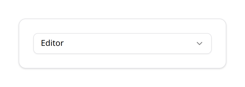
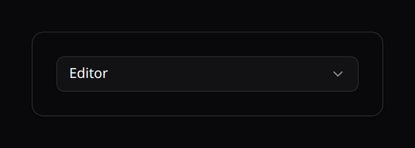
Renders an HTML dropdown <select>. Supports static arrays, closures, and direct PHP Enum reflections.
use Happones\Kinetix\Forms\Components\Select;
use App\Enums\UserRole;

Select::make('role')
    ->options(UserRole::class)
    ->required();
Option Resolvers
- Enum Reflection: Pass the classname of any Enum — see Enums &
HasLabelbelow. - Array Mapping: Pass a simple key-value array:php
Select::make('tier') ->options([ 'free' => 'Free Tier', 'pro' => 'Professional Account', ]); - Closure Resolver: Evaluate options dynamically based on the current model record:php
Select::make('manager_id')
    ->options(fn (?User $record) => User::where('id', '!=', $record?->id)->pluck('name', 'id')->toArray());
Enums & HasLabel
Pass an Enum class straight to options() and Kinetix builds the option list from its cases. Labels resolve in this order:
getLabel(), when the enum implementsHappones\Kinetix\Support\Contracts\HasLabel— or simply defines a publicgetLabel(): ?stringmethod. Resolution is duck-typed, so enums written against an equivalent third-party label contract work in Kinetix unchanged.- Otherwise the backing
value(backed enums) or the casename(pure enums).
use App\Enums\TaskStatus;

Select::make('status')
    ->options(TaskStatus::class)
->default(TaskStatus::Todo->value);namespace App\Enums;
use Happones\Kinetix\Support\Concerns\HasLabelOptions;
use Happones\Kinetix\Support\Contracts\HasLabel;
enum TaskStatus: string implements HasLabel
{
use HasLabelOptions;
case Todo = 'todo';
case Done = 'done';
public function getLabel(): ?string
{
return match ($this) {
self::Todo => __('To do'),
self::Done => __('Done'),
};
}
}The optional HasLabelOptions concern adds a static TaskStatus::options() helper (['todo' => 'To do', 'done' => 'Done']) for the places where you need the array yourself.
Define the enum once and it drives every surface: Select, Radio, TextColumn->badge(), SelectColumn, SelectFilter, Infolist entries, and export columns. See Tables → Enum Support & Contracts for the color and icon contracts (HasColor, HasIcon) used by badges and icon columns.
Searchable (combobox)
Call ->searchable() to render the field as a combobox with a search box (Reka UI Combobox) instead of a plain dropdown. With only options(), the search filters them client-side:
Select::make('country')->searchable()->options($countries);For large datasets, search a model remotely with ->searchUsing() — the client queries the server as you type (debounced + lazy, fetched only when the field is opened), so you never ship thousands of options:
Select::make('author_id')
    ->searchable()
    ->searchUsing(
        model: \App\Models\Author::class,
        labelColumn: 'name',
        searchColumns: ['name', 'email'],   // columns the server LIKE-matches
        valueColumn: 'id',
    );
The model + columns are encrypted into a signed token (the query string can never name an arbitrary table/column — same guard as inline table edits), and the currently-selected option's label is resolved server-side so it shows immediately. Remote search hits POST {prefix}/forms/search.
From a relationship
The relation already names the related model and its key, so ->relationship() replaces repeating them (the same API SelectFilter exposes):
Select::make('author_id')->relationship('author', 'name');

// Narrow the options:
Select::make('author_id')
    ->relationship('author', 'name', fn ($query) => $query->where('active', true));
Inherited by CheckboxList and Radio — the three option-backed fields — so a BelongsToMany renders as a checkbox list with one line. Kinetix resolves the options; persisting a pivot stays your job in mutateFormDataBeforeSave() or the controller.
The owning model comes from the form: Form::make()->model(Article::class), or inferred when you fill() it with a record. Without one the relation can't be resolved and the field falls back to whatever options() holds — it never throws.
Combining it with search
->relationship(...)->searchable() derives the remote-search token from the relation, so the two can't disagree about the model or the label column.
The query modifier travels with it only as the class-string of an invokable class — the token round-trips through the browser, and a closure can't be serialized:
Select::make('author_id')
    ->relationship('author', 'name', \App\Kinetix\ActiveAuthors::class)
    ->searchable();
A closure still shapes the eagerly-loaded options; it just doesn't reach the search endpoint. (Same reasoning as the config callbacks — see Membership.)
Eager options are capped
Without searchable(), a relationship() loads the related rows into the page payload, capped at kinetix.forms.relationship_options_limit (200). Past the cap the list is truncated and a warning is logged — declare the field searchable() so options are fetched on demand instead of shipping a table to the browser.
Scope remote search in a multi-tenant app
A searchable Select queries the related model directly, so with no bound it will happily return every tenant's labels, 20 rows per request. The search descriptor is bound to the user and team it was minted for and expires (kinetix.tables.token_ttl), but that stops replay — not a legitimate user searching too widely. Declare the tenant key:
Select::make('project_id')
    ->relationship('project', 'name')
    ->searchable()
    ->searchScope(['team_id' => $request->user()->currentTeam->getKey()]);
searchScope() takes plain equality constraints. For anything else, use the invokable query-modifier class shown above.
3. Checkbox
Renders a custom toggle checkbox. To match design standards, it automatically maps to our custom frontend <KinetixCheckbox> component instead of browser default checkboxes.
use Happones\Kinetix\Forms\Components\Checkbox;

Checkbox::make('terms_accepted')
    ->label('I accept the license agreement')
    ->required();
4. Toggle
Renders a modern, animated toggle switch. Perfect for binary configurations.
use Happones\Kinetix\Forms\Components\Toggle;

Toggle::make('is_active')
    ->label('Account Status')
    ->default(true);
5. Textarea
Renders an HTML <textarea> for multi-line inputs.
use Happones\Kinetix\Forms\Components\Textarea;

Textarea::make('bio')
    ->rows(4) // Adds row count attributes
    ->maxLength(500);
6. DatePicker & DateTimePicker
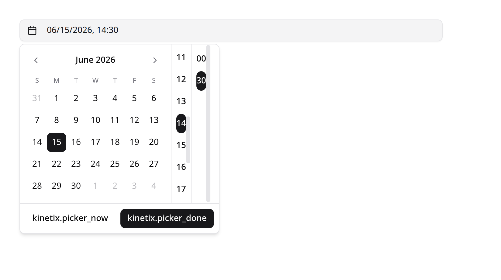
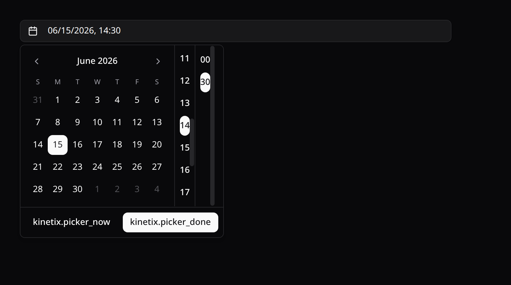
Both render the shadcn calendar by default (Reka UI popover) — DatePicker a single-date calendar, DateTimePicker a calendar plus scrollable hour/minute button columns. Call ->native() to fall back to a plain native <input type="date"> / datetime-local.
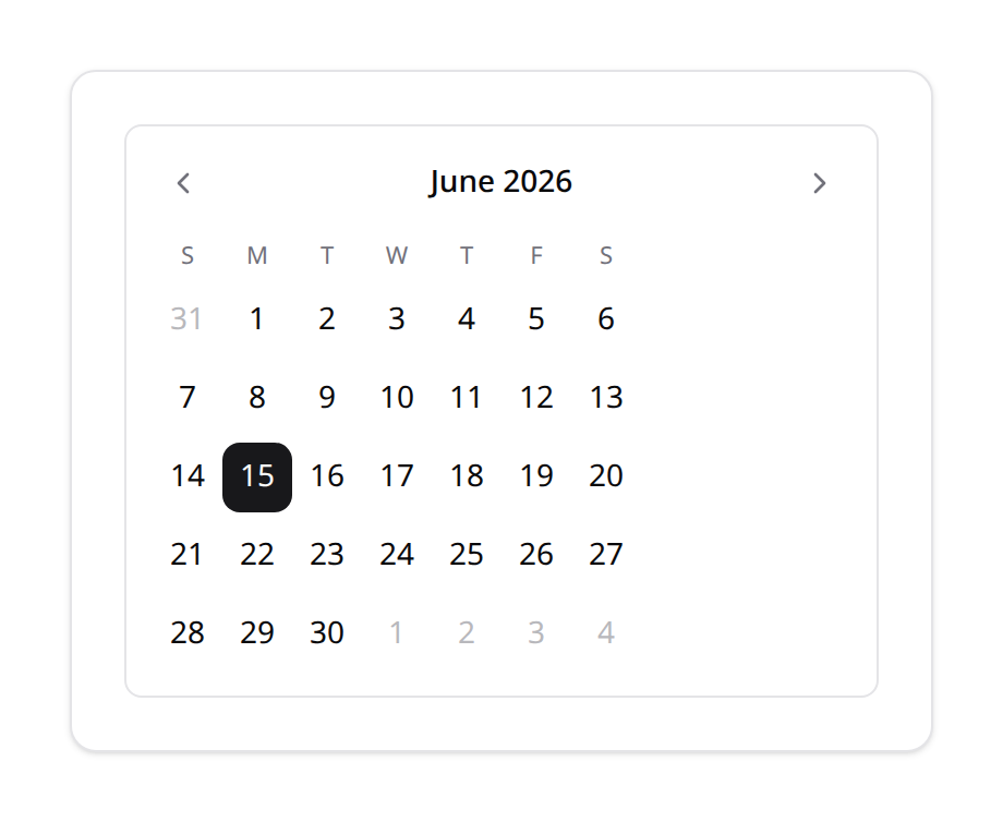
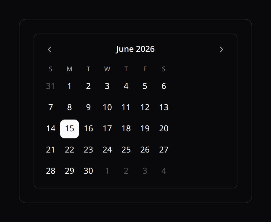
DateTimePicker (popover open) — calendar + hour/minute columns:
use Happones\Kinetix\Forms\Components\DatePicker;
use Happones\Kinetix\Forms\Components\DateTimePicker;

DatePicker::make('published_at')->locale('es');          // shadcn calendar
DatePicker::make('published_at')->native();              // native input

DateTimePicker::make('scheduled_at')
    ->label('Schedule Release')
    ->minuteStep(15)     // 15-minute increments
    ->twelveHour()       // 12h clock with an AM/PM column
->confirm(); // commit only via the Apply button (draft until then)| Method | Applies to | Description |
|---|---|---|
->native() | both | Render the native input instead of the shadcn calendar |
->locale(string) | both | BCP-47 calendar locale ('es', 'fr', 'en-US') — defaults to the application locale (app()->getLocale(), es_MX → es-MX); also the default for MonthPicker/WeekPicker/DateRangePicker calendars and NumberField number formatting |
->minuteStep(int) | DateTimePicker | Minute granularity for the time column (default 5) |
->twelveHour() | DateTimePicker | 12-hour clock with an AM/PM column |
->confirm() | both | Explicit-commit variant: clicks build a draft inside the popover, the footer button becomes Apply (the only thing that emits), and dismissing any other way (outside click / Escape) discards the draft |
->todayButton() | DatePicker | Show a Today shortcut in a popover footer |
->closeOnSelect(bool) | DatePicker | Whether picking a date closes the popover (default true — the shadcn behavior); pass false to keep it open |
->typed() / ->typed(string $format) | both (+ TimePicker, MonthPicker) | Type the value on the keyboard over a mask, the picker on a button to the right — see Typed input |
Timezones: app.timezone by default, per-field override
Picker values are naive wall-time strings (Y-m-d, H:i, Y-m-dTH:i) whose implicit timezone is Laravel's app.timezone — exactly what Carbon::parse() assumes when the value reaches the server. Everything that computes "now" client-side honors that: the Today/Now presets and the calendar's initial month read the clock in the app timezone (shared via kinetix_config.timezone), never the browser's — a viewer in Madrid using a Mexico City app gets Mexico City's today/now, not their own.
Override it per field when one input means a different zone:
DateTimePicker::make('scheduled_at')->timezone('America/Mexico_City');
TimePicker::make('opens_at')->timezone('Asia/Tokyo');
DatePicker::make('published_at')->timezone('UTC');
The standalone Vue components accept the same timezone prop (an IANA name); without it they use the shared app timezone, and outside an Inertia app they fall back to the browser clock. Invalid names never throw — they fall back too.
What this is (and isn't). The field stores wall time in the effective timezone; with the default (
app.timezone) that round-trips into Carbon and your database with no conversion at all. A per-field->timezone()means "this input's wall time is in that zone" — if it differs fromapp.timezone, convert on save (Carbon::parse($value, 'Asia/Tokyo')->setTimezone(config('app.timezone'))). The pickers deliberately do not silently convert values between zones.
Typed input: keyboard entry over a mask
For people who capture dates all day, clicking through a calendar is the slow path. ->typed() turns the trigger into a masked text input: the reader types digits, the separators of the format appear as they go, and the calendar (or clock, or month grid) stays one click away on a button to the right. It works on DatePicker, DateTimePicker, TimePicker and MonthPicker.
DatePicker::make('born_on')->typed('dd/mm/yyyy');              // 15/03/2026
DatePicker::make('invoiced_on')->typed('mm/dd/yyyy');          // 03/15/2026
DatePicker::make('shipped_on')->typed('yyyy-mm-dd');           // 2026-03-15
DateTimePicker::make('starts_at')->typed('dd/mm/yyyy HH:mm');  // 15/03/2026 19:05
DateTimePicker::make('starts_at')->twelveHour()->typed();      // locale order, 12h clock
TimePicker::make('opens_at')->typed('hh:mm a');                // 07:05 PM
MonthPicker::make('period')->typed('mm/yyyy');                 // 03/2026
DatePicker::make('born_on')->typed(); // the reader's locale order| Token | Means |
|---|---|
dd | Day, two digits |
mm | Month in the date part, minutes in the time part |
yyyy / yy | Year, four or two digits (yy reads as 20yy) |
HH / hh | Hour on a 24-hour / 12-hour clock |
a | AM/PM — typed as a or p |
| anything else | A separator, inserted for the reader |
The time part starts at the first space or at the first hour token, so dd/mm/yyyy HH:mm reads its second mm as minutes.
- The stored value doesn't change. Whatever the format, the field still holds the ISO value (
Y-m-d,Y-m-dTH:i,H:i,Y-m), so your validation rules and casts are the same as without->typed(). - No format = the reader's locale order.
->typed()alone follows the field's locale (dd/mm/yyyyfores-MX,mm/dd/yyyyforen-US,dd.mm.yyyyforde-DE); the time part follows the field's clock (->twelveHour()), not the locale's. - Typing helps. A first digit no two-digit value can start with is padded (
4in the day becomes04/), letters are ignored, and AM/PM is filled fromaorp. On phones the keypad is numeric unless the format has an AM/PM part. - It says what's wrong, under the field. A date that doesn't exist (
31/02/2026), a time that doesn't (25:00), a date outsideminValue()/maxValue()or the rules' bounds (after:today), and — on leaving the input — a half-typed value each get a message. While the text isn't a usable value, the field holdsnull, so a stale value never submits behind what the reader sees; arequiredrule catches it. - A format that can't be filled is refused where you write it.
DatePicker::make('d')->typed('dd/mm')throws anInvalidArgumentExceptionnaming the missing part, as doeshhwithouta.
The standalone Vue components take the same option as props: <KinetixDatePicker typed input-format="dd/mm/yyyy" /> (and on KinetixDateTimePicker, KinetixTimePicker, KinetixMonthPicker). The mask on its own is <KinetixMaskedDateInput kind="date" format="dd/mm/yyyy" v-model:value="date" />, with a button slot for whatever goes on its right.
Close behavior & the footer, by design
DatePickercloses on select (one decision = done — the shadcn default), and shows no footer unless you opt into->todayButton()or->confirm().DateTimePickerdeliberately does NOT close on date select — a time is still pending. It always shows a footer: Now (current date + time, rounded tominuteStep) and Done, the explicit dismissal a multi-part picker needs (never rely on outside-click alone). Live mode commits every click as it happens;->confirm()turns Done into Apply and defers the commit to it.- On mobile the panel stacks (calendar above the time columns), caps at
80dvhwith internal scrolling, and the time buttons grow to touch-size (~40px rows) — desktop keeps the compactsm:layout.
TimePicker
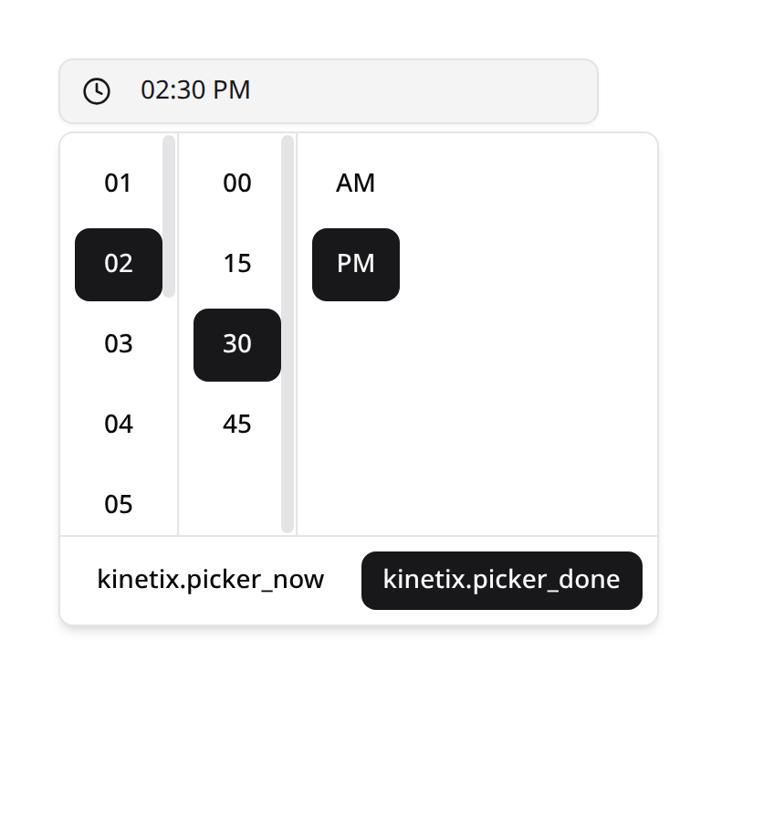
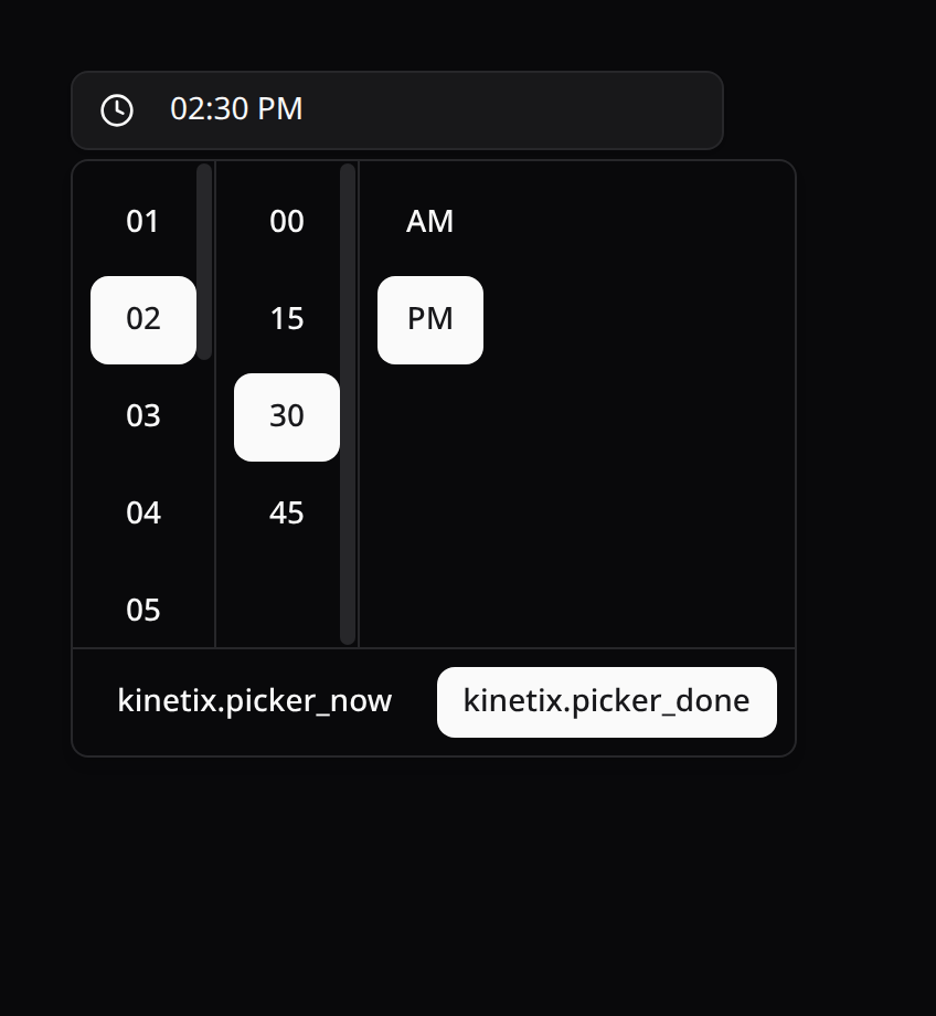
A time-only field (no date). Renders an input-style trigger that opens a popover with scrollable hour/minute (+ AM/PM) columns, storing an H:i string (e.g. "14:30"). Defaults to a 12-hour clock with AM/PM — call ->twentyFourHour() for 24-hour. ->native() renders <input type="time">.
use Happones\Kinetix\Forms\Components\TimePicker;

TimePicker::make('opens_at');                       // 12h + AM/PM (default)
TimePicker::make('opens_at')->twentyFourHour();     // 24h clock
TimePicker::make('opens_at')->minuteStep(15);       // 15-minute increments
TimePicker::make('opens_at')->native();             // native <input type="time">
TimePicker::make('opens_at')->confirm();            // commit only via Apply
Like DateTimePicker, the popover has a footer: Now (current time rounded to minuteStep) and Done — or Apply with ->confirm(), which defers the commit to that button and discards the draft on any other dismissal.
BusinessHours (weekly schedule)
A weekly business-hours editor — one row per day with an enable switch, one or more HH:MM time ranges, add/remove range and Apply to all days. Day names come from Intl in the active locale. Defaults to Monday–Friday 09:00–17:00, and the structure is validated server-side automatically (the kinetix_weekly_schedule rule, seeded by the field):
use Happones\Kinetix\Forms\Components\BusinessHours;

BusinessHours::make('hours');
Times are picked with the same picker as TimePicker (12-hour with AM/PM by default), each one named for screen readers ("Monday opens at, 09:00 AM"):
BusinessHours::make('hours')->twentyFourHour()->minuteStep(15);Pair the column with the AsWeeklySchedule cast to read it back as a value object:
use Happones\Kinetix\Support\Casts\AsWeeklySchedule;

protected $casts = ['hours' => AsWeeklySchedule::class];$venue->hours?->isOpenAt(now($venue->timezone)); // bool — pass the moment in ITS timezone
$venue->hours?->isOpenNow($venue->timezone); // shortcut
$venue->hours?->effectiveSchedule(); // full normalized week array
$venue->hours?->rangesFor('monday'); // enabled ranges (empty when off)- A range whose end is at or before its start wraps past midnight — friday
22:00–02:00keeps saturday 01:00 open through friday's entry. - The stored shape is
{ monday: { enabled, ranges: [{ start, end }] }, … }with all seven days always present; disabled days keep their last ranges so re-enabling restores them. WeeklySchedule::fromArray()normalizes loose input (invalid ranges dropped, unknown keys removed); the validation rule is the STRICT gate — also usable standalone:'hours' => ['array', 'kinetix_weekly_schedule'].
MonthPicker, YearPicker & WeekPicker
Coarser date pickers. Each renders a shadcn popover by default and accepts ->native() for the browser-native input, plus ->minValue() / ->maxValue() bounds (mapped to the native min/max).
| Field | Stores | Shadcn UI | Native input |
|---|---|---|---|
MonthPicker | Y-m ("2026-06") | month grid + year nav | <input type="month"> |
YearPicker | Y ("2026") | paginated year grid | <input type="number"> |
WeekPicker | o-\WW ("2026-W25") | calendar — clicking a day highlights its whole week | <input type="week"> |
All three share the picker behavior contract: ->confirm() (draft + Apply-only commit), ->todayButton() (a "This month" / "This year" / "This week" shortcut), ->closeOnSelect(false), and ->timezone() — the current-period preset and the initial view read the clock in app.timezone by default, never the browser's (see Timezones). The standalone Vue components accept the same props.
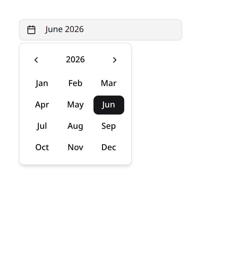
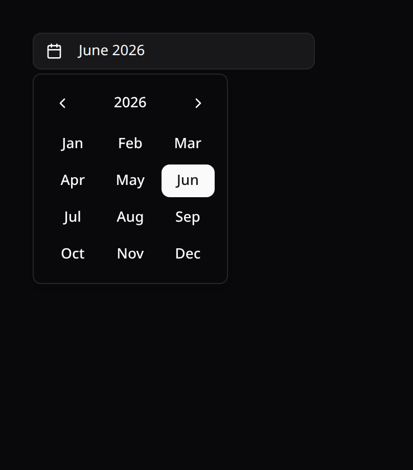
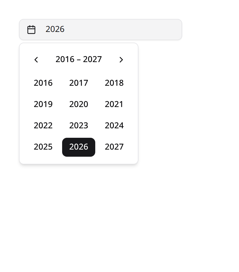
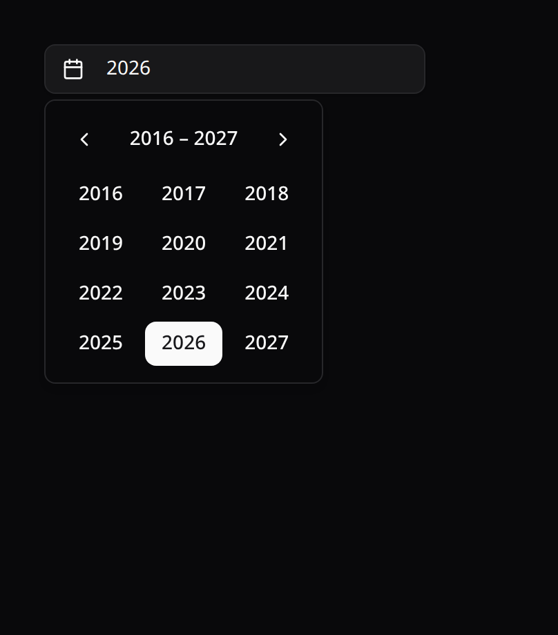
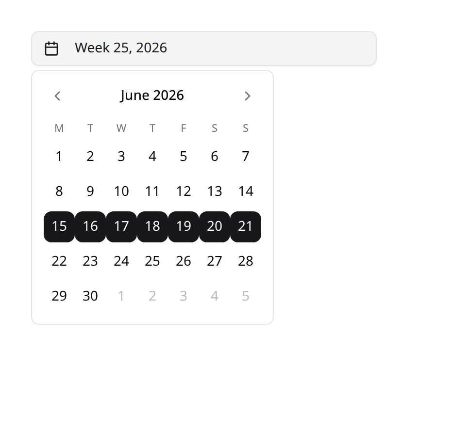
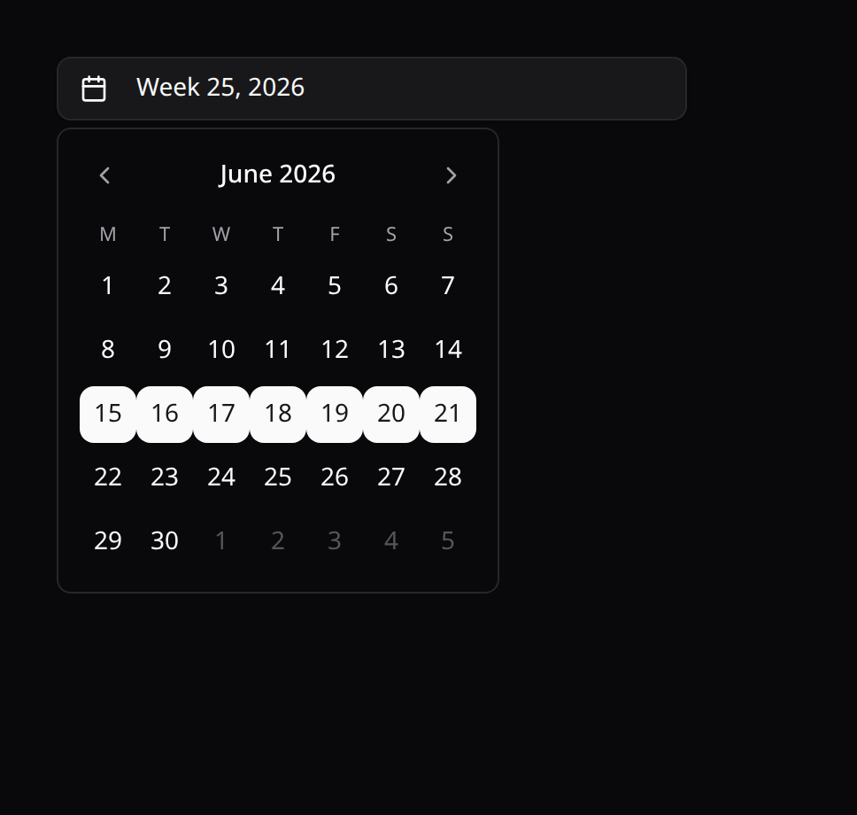
use Happones\Kinetix\Forms\Components\{MonthPicker, YearPicker, WeekPicker};

MonthPicker::make('billed_month')->minValue('2026-01')->maxValue('2026-12');
YearPicker::make('fiscal_year')->minValue('2020')->maxValue('2030');
WeekPicker::make('sprint')->startWeek(0);   // week starts Sunday (0=Sun … 6=Sat)
WeekPicker::make('sprint')->native();       // native <input type="week">
WeekPicker/WeekFiltertake->startWeek(int)(0=Sunday … 6=Saturday, default Monday) since the first day of the week is region-dependent.
The same three are available as table filters — see Tables → Filters (
MonthFilter,YearFilter,WeekFilter).
DateRangePicker
Pick a start + end date. Stores { from, to } (each an ISO Y-m-d string). Renders the shadcn range calendar in a popover by default, or two native date inputs via ->native(). Supports ->numberOfMonths(), ->weekdayFormat(), ->fixedWeeks(), ->locale(), and ->minValue() / ->maxValue() bounds.
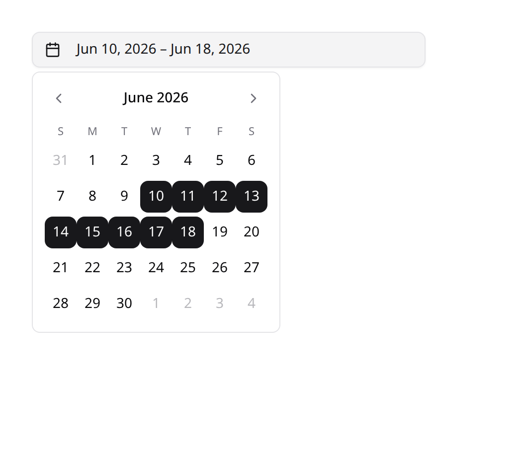
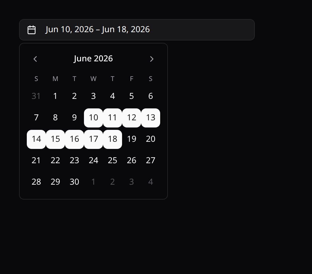
use Happones\Kinetix\Forms\Components\DateRangePicker;

DateRangePicker::make('period')->numberOfMonths(2);
DateRangePicker::make('period')->minValue('2026-01-01')->maxValue('2026-12-31');
DateRangePicker::make('period')->native();   // two native <input type="date">

// Same behavior variants as the other pickers:
DateRangePicker::make('period')->confirm();            // commit only via Apply
DateRangePicker::make('period')->todayButton();        // Today (from = to = today)
DateRangePicker::make('period')->closeOnSelect(false); // stay open when complete
DateRangePicker::make('period')->timezone('America/Mexico_City');
By default the popover closes once both ends are picked; ->confirm() switches to the draft + Apply contract, ->todayButton() adds a Today shortcut, and — like every picker — "today" is read in app.timezone (overridable per field with ->timezone()), never the browser clock. See Timezones and Close behavior above.
Persist {from,to} to a JSON-cast column, or split it in a dehydrateStateUsing() callback. As a table filter, use DateRangeFilter (see Tables → Filters).
AddressPicker
A structured address field. Stores { line1, line2, city, state, postalCode, country } and renders a text input per part plus a searchable country select sourced from a built-in ISO 3166-1 list. Limit/reorder the sub-fields with ->fields(), hide one or more with ->except(), or replace the country options with ->countries().
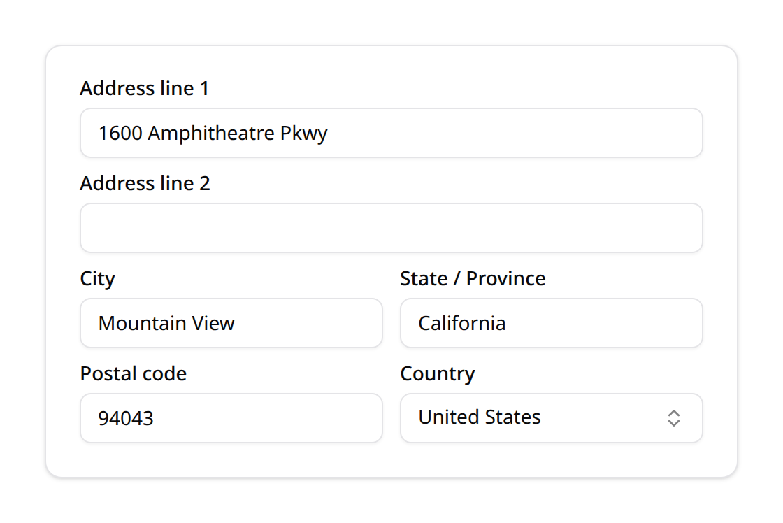
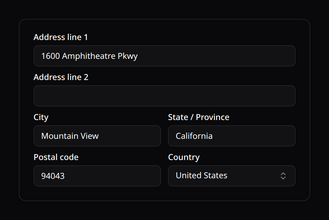
use Happones\Kinetix\Forms\Components\AddressPicker;

AddressPicker::make('address');                              // all six sub-fields
AddressPicker::make('address')->fields(['line1', 'city', 'country']);
AddressPicker::make('address')->except('country');           // hide the country select
AddressPicker::make('address')->except(['line2', 'country']);
AddressPicker::make('address')->countries(['US' => 'United States', 'MX' => 'Mexico']);
Persist the value to a JSON-cast column, or split it into separate columns in a dehydrateStateUsing() callback. As a table filter, use AddressFilter (see Tables → Filters).
RichEditor
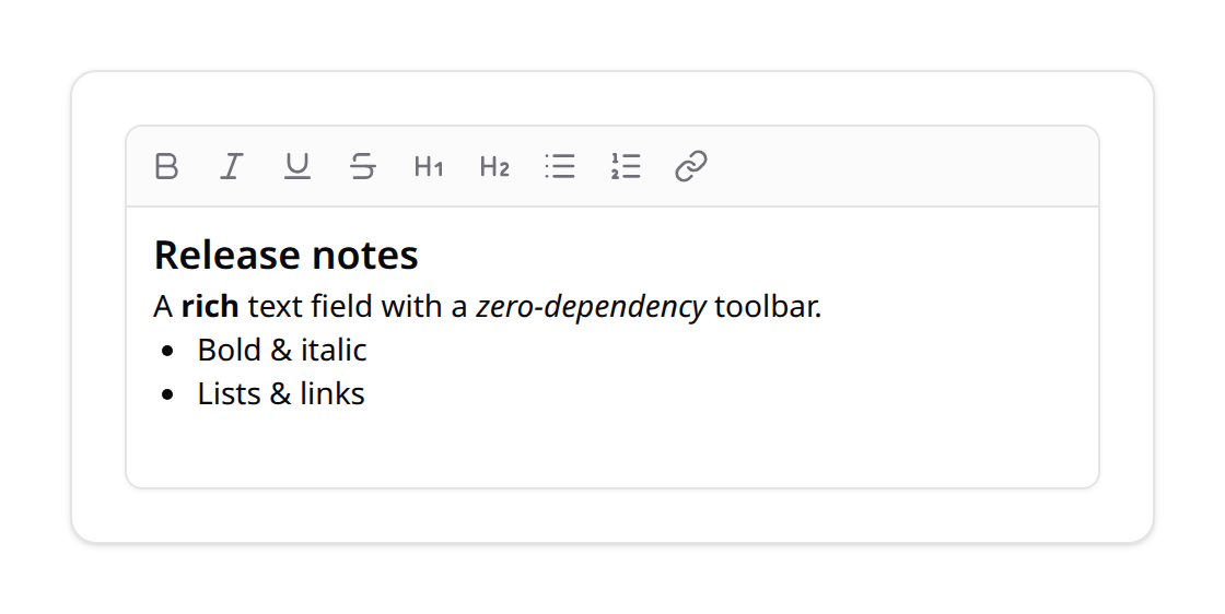
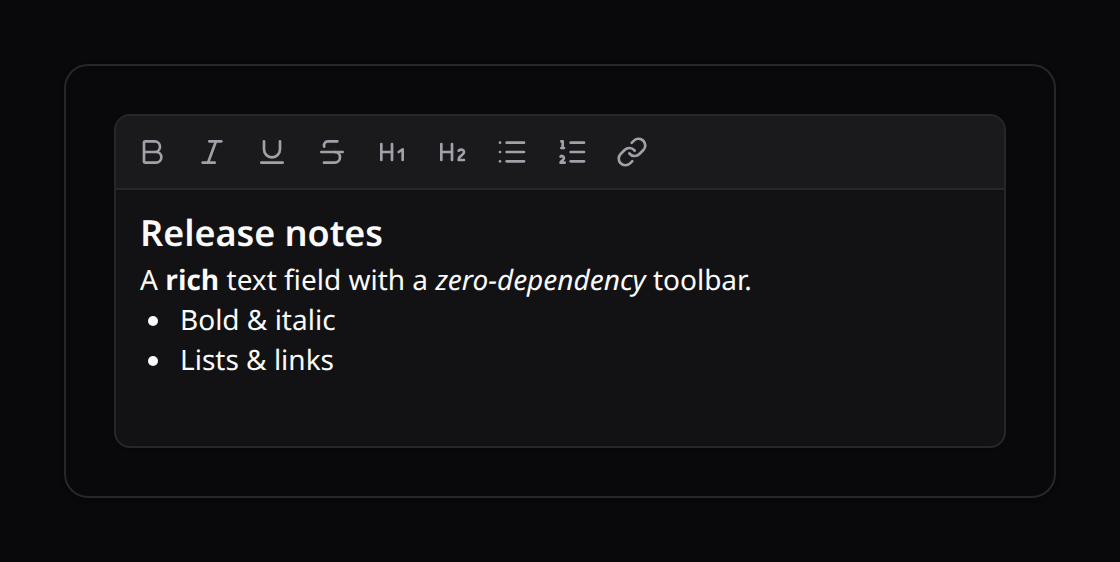
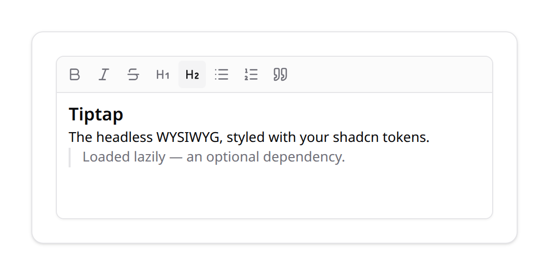
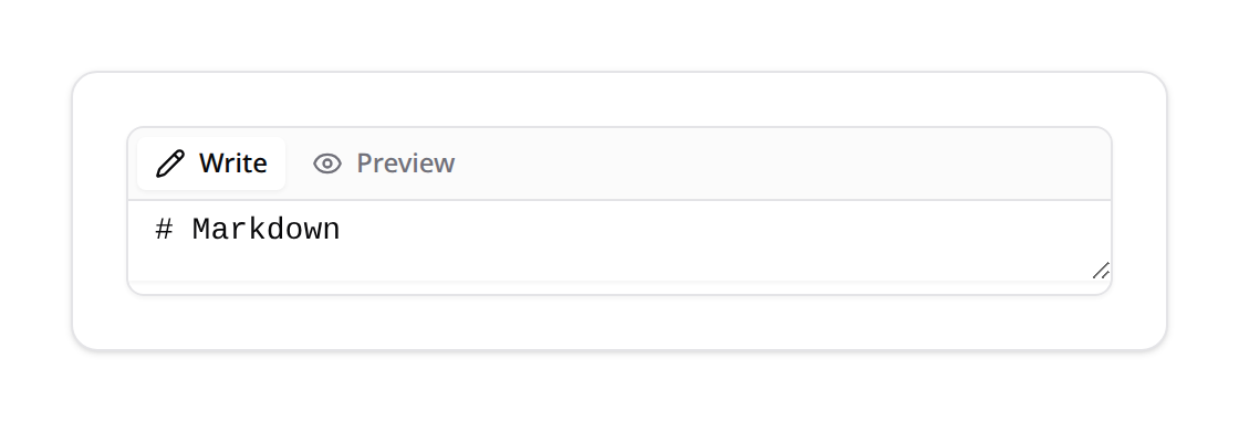
A rich text / WYSIWYG field with three swappable editor drivers. The default driver comes from config('kinetix.forms.rich_editor'); override per field with ->editor() or the ->basic() / ->tiptap() / ->markdown() shortcuts.
| Driver | Dependency | Stores | Notes |
|---|---|---|---|
basic (default) | none | HTML | contenteditable + toolbar; works out of the box |
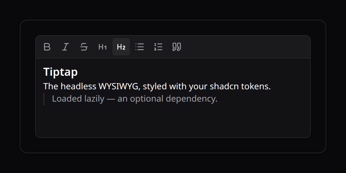
tiptap | @tiptap/core + @tiptap/starter-kit (MIT) | HTML | the headless WYSIWYG standard, styled with your shadcn tokens; loaded lazily |
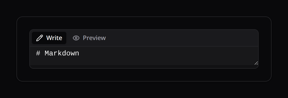
markdown | none | Markdown | textarea + live preview |
use Happones\Kinetix\Forms\Components\RichEditor;

RichEditor::make('body');               // config default (basic)
RichEditor::make('body')->tiptap();     // rich WYSIWYG (opt-in dependency)
RichEditor::make('notes')->markdown();  // Markdown source + preview
To use the Tiptap driver, install its packages and register them in your entry file — the import must live in your module graph, because no import shape inside a published component can be optional at build time and still resolve at runtime:
npm install @tiptap/core @tiptap/starter-kit// resources/js/app.ts
import { registerKinetixTiptap } from '@/composables/useKinetixRichEditorEngine';
registerKinetixTiptap(async () => ({
core: await import('@tiptap/core'),
starterKit: await import('@tiptap/starter-kit'),
}));The loader uses dynamic imports, so Tiptap stays code-split — it downloads only when a ->tiptap() field actually renders. Apps that never register keep building and running unaffected; a ->tiptap() field without a registration shows an inline notice with these instructions.
HTML is not sanitized server-side
The basic / tiptap drivers store raw HTML. Kinetix does not sanitize it — escape or sanitize on output (Blade escapes by default; only v-html / {!! !!} render it raw). Run user HTML through a sanitizer (e.g. HTMLPurifier) if untrusted.
NumberField
A numeric input with increment / decrement stepper buttons, min / max / step bounds and Intl.NumberFormat formatting (decimal, percent or currency). Built on Reka UI's NumberField.
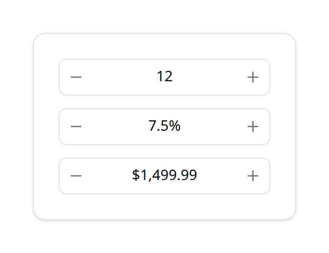
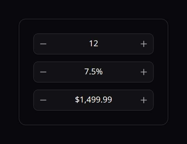
use Happones\Kinetix\Forms\Components\NumberField;

NumberField::make('quantity')->min(0)->max(99)->step(1);
NumberField::make('rate')->percent()->decimals(0, 2);   // 0–2 fraction digits
NumberField::make('price')->currency('USD');
NumberField::make('weight')->step(0.1)->numberLocale('de-DE');
It stores a plain number (or null when cleared). As an inline-editable table column, use NumberInputColumn (see Tables → Editable columns).
Slider, Rating & PinInput
Three focused value inputs.
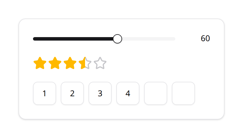
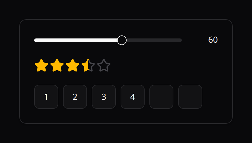
Slider — a single-value range slider (Reka UI), storing a number:
use Happones\Kinetix\Forms\Components\Slider;

Slider::make('volume')->min(0)->max(100)->step(5);
Rating — a star rating storing 0..max (click the current value to clear):
use Happones\Kinetix\Forms\Components\Rating;

Rating::make('score')->max(5);
Rating::make('score')->max(10)->allowHalf();   // half-stars
PinInput — a segmented PIN / OTP input (Reka UI), storing the joined string:
use Happones\Kinetix\Forms\Components\PinInput;

PinInput::make('code')->length(6)->otp();          // one-time-code autofill
PinInput::make('pin')->length(4)->numeric()->mask();
SlugInput & SignaturePad
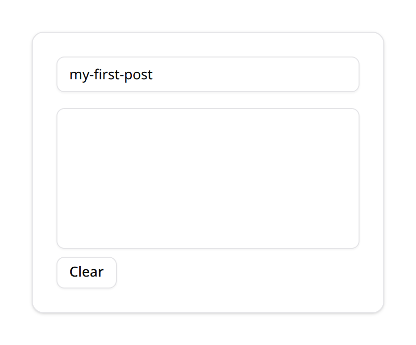
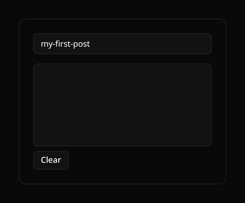
SlugInput — a URL-slug text input. Point from() at a sibling field and the slug is generated live from it until the user edits the slug manually:
use Happones\Kinetix\Forms\Components\SlugInput;

SlugInput::make('slug')->from('title');
SlugInput::make('slug')->from('name')->separator('_');
SignaturePad — a canvas the user signs on (mouse, touch or pen). Stores a PNG data URL; a Clear button resets it. Persist it to a TEXT column, or decode + store it as a file in dehydrateStateUsing().
use Happones\Kinetix\Forms\Components\SignaturePad;

SignaturePad::make('signature');
SignaturePad::make('signature')->penColor('#1d4ed8')->height(180);
GeneratorInput
A text input with a one-click VALUE GENERATOR beside it — passwords, PINs, usernames, tokens, or any custom charset. Generation is client-side and crypto-strong (uniform, no modulo bias), so nothing round-trips the server. It ships a catalog of presets (compose by data, add one in a single place) plus a fully custom escape hatch.
use Happones\Kinetix\Forms\Components\GeneratorInput;

// Password — toggle classes, exclude look-alikes, copy + mask affordances
GeneratorInput::make('password')->password(length: 20)->symbols(false)->excludeAmbiguous()->copyable()->masked();

// PIN — numeric | alphanum | alpha
GeneratorInput::make('pin')->pin(length: 6, mode: 'numeric');

// Username — from a pattern of SIBLING fields (followed live until edited),
// normalized to a safe handle; falls back to a random handle until they fill in
GeneratorInput::make('username')->username()->pattern('{first_name}.{last_name}')->separator('.');| Method | Effect |
|---|---|
password(length) / pin(length, mode) / username(length) | Preset + kind |
length(n) | Characters to generate |
lowercase() / uppercase() / digits() / symbols() | Toggle a password class (pass false to drop it) |
symbolSet('…') | Override the symbol alphabet |
excludeAmbiguous() | Drop look-alikes (O/0, l/1/I, …) |
pattern('{a}.{b}') / separator('.') | Username from sibling fields |
copyable() | Click-to-copy beside the generate button |
masked() | Hide the value behind a reveal toggle |
Presets
Pick a ready-made generator by name — explicit knobs set afterwards still win (->preset('password-strong')->length(24)):
GeneratorInput::make('token')->preset('api-key');       // sk_… 40 base62
GeneratorInput::make('serial')->preset('license-key');  // XXXX-XXXX-XXXX-XXXX
GeneratorInput::make('id')->preset('uuid');             // RFC-4122 v4
GeneratorInput::make('nick')->preset('handle-memorable'); // brave-otter-42| Group | Presets |
|---|---|
| Passwords | password-strong, password-simple, password-memorable, passphrase |
| PINs / codes | pin-4, pin-6, otp, pin-alphanum |
| Usernames | handle, handle-memorable (+ username()->pattern(…)) |
| Tokens / ids | uuid, hex, hex-64, nanoid, api-key, license-key, slug |
An unknown name throws (GeneratorInput::PRESETS lists them all), so a typo fails where you wrote it instead of silently generating something else.
How strong each password preset is:
| Preset | Shape | Strength |
|---|---|---|
password-strong | 16 characters, every class | ~103 bits; uses each of lower, upper, digit and symbol at least once |
password-simple | 14 letters and digits, no look-alikes | ~81 bits; uses each enabled class at least once |
passphrase | 6 words (brave otter calm river …) | ~51 bits |
password-memorable | 4 words + 2 digits | ~41 bits |
handle and handle-memorable make handles, not secrets (~24–52 bits), and nothing checks them for collisions: add a unique rule to the field.
A username pattern (username()->pattern('{first_name}.{last_name}')) fills the field in as the user types the sibling fields, and keeps following them until the user types a username of their own.
The value is generated in the browser, so treat it like any input: validate it on the server, and hash a password before you store it (a hashed cast). An edit form never sends an attribute its model keeps out of serialization back to the browser: one in $hidden such as password, one left out of a $visible whitelist, or a related model's (owner.password). It renders empty, without the field's default(), and saved untouched (blank, or off for a toggle) it keeps the stored value.
Custom
When no preset fits, describe your own — an explicit alphabet, a mask template, memorable words, or a value prefix:
GeneratorInput::make('code')->custom(alphabet: 'ABCDEF0123', length: 8);
GeneratorInput::make('ref')->custom(mask: 'INV-####-AA');   // # digit, A upper, a lower, * alnum, H hex
GeneratorInput::make('nickname')->words(2, separator: '-', appendDigits: 2);
GeneratorInput::make('key')->preset('nanoid')->valuePrefix('tok_');
The standalone <KinetixGenerator> can show a live preset picker with :presets="true" (or an array of names) — handy for a "generate anything" tool.
Standalone — generating into another target
The same generator ships as a component for use outside a form, pointed at any target. Pass :input="false" and a target — a writer callback, a CSS selector, or an element (its .value is set and an input event dispatched, so a plain <input> or another framework picks it up):
<script setup lang="ts">
import KinetixGenerator from '@/components/kinetix/KinetixGenerator.vue';
</script>

<template>
  <!-- With its own input (v-model) -->
  <KinetixGenerator v-model:value="pwd" :config="{ kind: 'password', length: 16 }" copyable />

  <!-- Button only, writing into an external field -->
  <input id="api-key" />
  <KinetixGenerator
    :input="false"
    target="#api-key"
    :config="{ kind: 'password', length: 32 }"
  />
</template>
PhoneInput
An international phone field: a searchable country selector (flag + dial code, from a built-in list of all calling codes) plus a national-number input. Stores the full E.164-style string, e.g. +5215512345678.
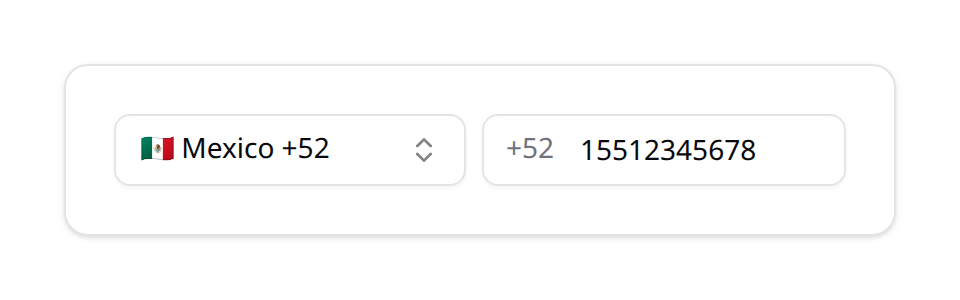
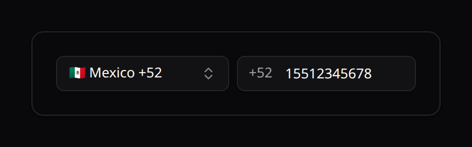
use Happones\Kinetix\Forms\Components\PhoneInput;

PhoneInput::make('phone')->defaultCountry('MX');
PhoneInput::make('phone')->countries(['US', 'MX', 'CA']);   // restrict the list
The country list comes from Support\Countries + Support\DialCodes; the selected country's dial code is prefixed to the number on save.
JsonInput
A JSON editor: a monospace text area that says whether the JSON holds and, when it doesn't, the line and column where it breaks, with a Format button that indents it. The json rule is added.
use Happones\Kinetix\Forms\Components\JsonInput;

JsonInput::make('settings');            // a JSON string column
JsonInput::make('settings')->decoded(); // a column cast to array: saves the array
A value the model already decoded (an array cast) opens formatted.
TimezoneSelect
A searchable time zone picker: every IANA zone, labelled with its current UTC offset and ordered by it ((UTC−06:00) America/Mexico City), so typing a city or an offset finds it. The timezone rule is added.
use Happones\Kinetix\Forms\Components\TimezoneSelect;

TimezoneSelect::make('timezone')->default(config('app.timezone'));
7. Hidden
Tracks form values that must be submitted to the backend without displaying them to the user.
use Happones\Kinetix\Forms\Components\Hidden;

Hidden::make('referrer_id')
    ->default(fn () => request('ref'));
8. Radio
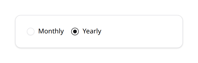

A single-choice radio group. Extends Select, so it shares the same options() API — including automatic PHP Enum reflection.
use Happones\Kinetix\Forms\Components\Radio;

Radio::make('plan')
    ->options(['free' => 'Free', 'pro' => 'Pro', 'team' => 'Team'])
    ->default('free');

// Enum-backed, laid out horizontally
Radio::make('status')
    ->options(PostStatus::class)
->inline();| Method | Description |
|---|---|
->options(array|Closure|string) | Choices map, closure, or Enum class (inherited from Select) |
->inline(bool = true) | Lay options out horizontally instead of stacked |
9. CheckboxList
A multi-choice list whose value is an array of the selected keys. Extends Select for option handling. Pair it with an array cast (or JSON column) on the model.
use Happones\Kinetix\Forms\Components\CheckboxList;

CheckboxList::make('permissions')
    ->options([
        'posts.create' => 'Create posts',
        'posts.delete' => 'Delete posts',
    ])
->inline();| Method | Description |
|---|---|
->options(array|Closure|string) | Choices map, closure, or Enum class (inherited from Select) |
->inline(bool = true) | Lay checkboxes out horizontally instead of stacked |
->bulkToggleable(bool = true) | A Select all checkbox above the options, with a count (2/5). It checks every option in view, or clears them, and shows a dash when only some are checked. With ->searchable() it acts on the options the search left, and leaves the rest of the selection as it is |
CheckboxList::make('channels')
    ->options(['mail' => 'Mail', 'sms' => 'SMS', 'push' => 'Push'])
    ->searchable()
    ->bulkToggleable();
10. ColorPicker
A native color swatch paired with a hex text input. The stored value is the hex string (e.g. #4f46e5).
use Happones\Kinetix\Forms\Components\ColorPicker;

ColorPicker::make('brand_color')
    ->default('#4f46e5');
11. TagsInput
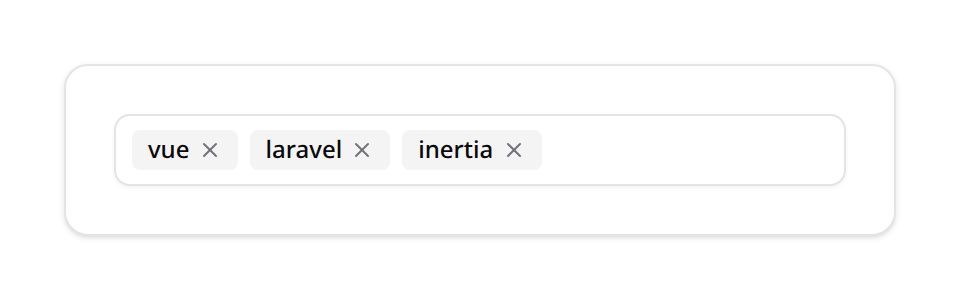
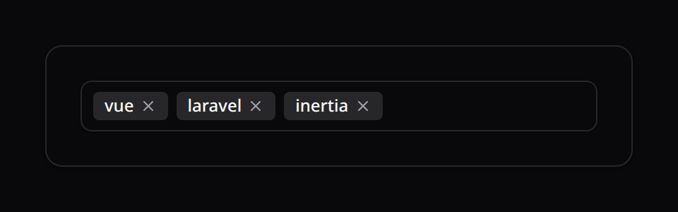
A free-text tag editor. The stored value is an array of strings. Type and press Enter or , to add a tag; Backspace on an empty input removes the last tag. Pair it with an array cast.
use Happones\Kinetix\Forms\Components\TagsInput;

TagsInput::make('skills')
    ->placeholder('Add a skill and press Enter');
Local typing state is encapsulated in the dedicated KinetixTagsInput.vue component, so the buffer never leaks across fields.
A tag already in the list isn't added again: the input says so and points at the existing tag. With distinct:ignore_case on the items ('skills.*' => 'distinct:ignore_case', or the field's own rules) a repeat in another case counts too, and a max: on the list stops the input once it's full.
12. KeyValue
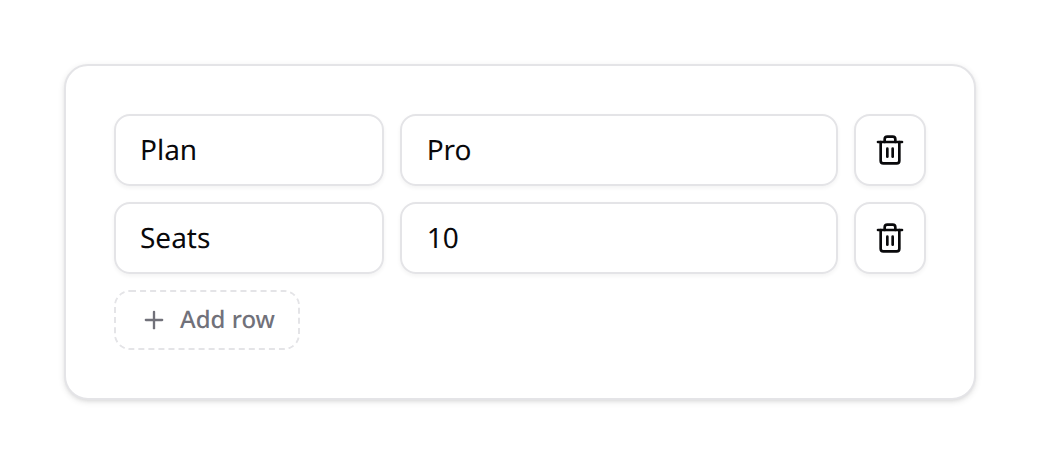
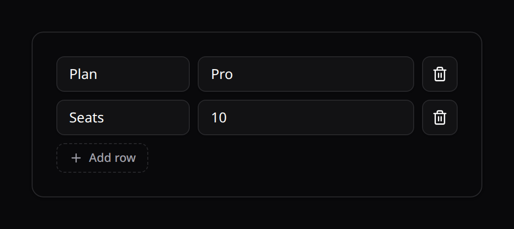
An editable map of key/value string pairs. The stored value is an associative array (object). Pair it with an array cast.
use Happones\Kinetix\Forms\Components\KeyValue;

KeyValue::make('metadata');
Fix the keys with ->keys(['title', 'color']) (Laravel's array:title,color rule, which it adds): the field shows one labelled input per key, with no rows to add or remove, and the server refuses any other key.
Row labels (Key, Value, Add row) come from the kinetix i18n namespace. Rendering and local row state live in KinetixKeyValue.vue, which resyncs from the parent only when the external value differs — avoiding an emit→prop feedback loop.
13. Repeater
Repeats a sub-schema over a list of items. The stored value is an array of objects, one per item. Pair it with an array cast (or a JSON column). Items can be added, removed, and reordered.
use Happones\Kinetix\Forms\Components\Repeater;
use Happones\Kinetix\Forms\Components\TextInput;
use Happones\Kinetix\Forms\Components\Select;

Repeater::make('line_items')
    ->schema([
        TextInput::make('description')->columnSpan(8)->required(),
        TextInput::make('quantity')->numeric()->columnSpan(2),
        Select::make('unit')->options(['ea' => 'each', 'kg' => 'kg'])->columnSpan(2),
    ])
    ->minItems(1)
    ->maxItems(20)
->addActionLabel('Add line item');| Method | Description |
|---|---|
->schema(array) | The fields repeated for each item |
->minItems(int) | Minimum items (disables removing below it) |
->maxItems(int) | Maximum items (disables adding above it) |
->addActionLabel(string) | Custom "add" button label (defaults to kinetix.add_item) |
Architecture note: KinetixFormSchema renders each item by recursing into itself with the item object as its scoped values, so any field type — including nested Grid/Section — works inside a repeater. New blank items are seeded from each sub-field's defaultValue. Validation treats the repeater as a single array-valued field (per-item rules are not auto-expanded in this version).
14. FileUpload
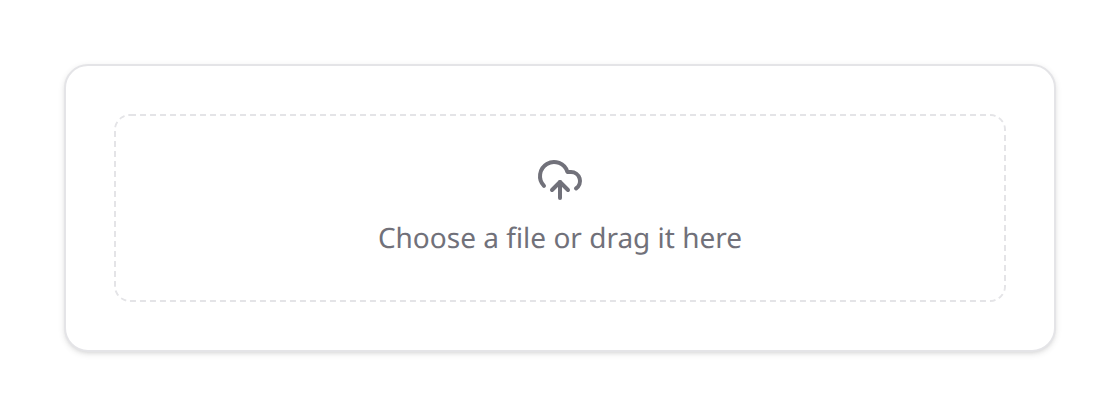
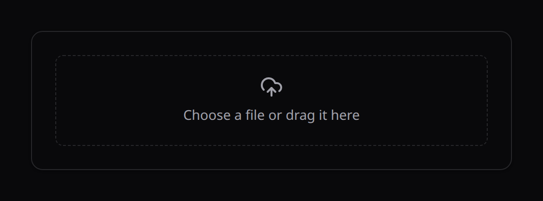
Uploads files to a storage disk and stores the resulting path (a string, or an array of strings when multiple()). Uploads happen immediately via a dedicated endpoint; the field value is the stored path(s).
use Happones\Kinetix\Forms\Components\FileUpload;

FileUpload::make('avatar')
    ->image()
    ->disk('public')
    ->directory('avatars')
    ->maxSize(1024); // KB

FileUpload::make('attachments')
    ->multiple()
    ->maxFiles(5)
    ->acceptedFileTypes(['application/pdf', 'docx'])
->directory('docs');| Method | Description |
|---|---|
->disk(string) | Storage disk; defaults to the global kinetix.filesystem.disk (public). Set to any disk (e.g. s3). |
->directory(string) | Target directory (default uploads) |
->multiple(bool = true) | Accept multiple files (value becomes an array) |
->image() | Restrict to images and render thumbnail previews |
->acceptedFileTypes(array) | MIME types (image/png) and/or extensions (pdf) |
->maxSize(int) | Max size per file in kilobytes |
->maxFiles(int) | Max number of files (multiple mode) |
Checked before the upload. The field's rules (mimes, extensions, mimetypes, image, File::types()->max(), max: in kilobytes, dimensions) are checked in the browser before a file is sent: a 40 MB photo or a PDF in an image field is refused with a message naming the file and why, the others in the same pick still upload, and the picker only offers the accepted types. The server validates again.
Security: the storage config (disk, directory, constraints) is signed into an encrypted uploadToken sent to the client; the upload endpoint (uploads/store) decrypts it, re-validates the file against the constraints, and stores it — the client can never choose an arbitrary disk/directory. A matching uploads/delete endpoint removes a file, constrained to the configured directory. Rendering and upload state live in KinetixFileUpload.vue. Pre-existing values render their preview via the public disk URL convention (/storage/{path}) or any absolute URL.
5. Operations & Visibility Constraints
You can restrict field rendering based on the type of operation (e.g. 'create' or 'edit') or active database record properties.
Setting the Operation & Model
The operation is inferred automatically when you pass a model ('edit' if the record exists, otherwise 'create'). You can set both explicitly on the Form, which is what visibleOn / hiddenOn evaluate against:
Form::operation(string $operation): Force the active operation (e.g.->operation('edit')).Form::model(string $model): Set the target model class (FQCN) when no model instance is passed.
Form::make()
    ->model(User::class)
    ->operation('create')
    ->schema([ /* ... */ ]);
Operation Restrictions
hiddenOn(string|array $operations): Hides the field on specified operations:phpTextInput::make('password') ->hiddenOn('edit'); // Password cannot be edited from this formvisibleOn(string|array $operations): Only displays the field during specified actions:phpTextInput::make('reset_token') ->visibleOn('create');
Closure Evaluators
Provide dynamic rules evaluated on the server using closures.
hidden(Closure|bool $condition): Hide dynamically.visible(Closure|bool $condition): Show dynamically.
TextInput::make('billing_vat_id')
    ->visible(fn (?Order $record) => $record && $record->requires_vat);
Authorization (Gate/Policy)
Fields are authorized on the server, using the same ->authorize() shorthand as Actions. A field that fails its check is dropped everywhere the form touches it: toArray()/toData() (never sent to the frontend), getValidationRules() (no rule generated), and getState() (never dehydrated) — so a user can't reveal or submit a field they aren't allowed to see.
// Laravel policy ability — checked against the record via Gate::allows($ability, $record):
TextInput::make('internal_notes')->authorize('editInternalNotes');

// Explicit subject (e.g. a create-time field with no record yet):
TextInput::make('role')->authorize('assignRole', Post::class);

// Any custom logic:
TextInput::make('salary')->authorize(fn (?Employee $record) => auth()->user()->isHr());| Method | Behaviour |
|---|---|
->authorize(string $ability, mixed $subject = null) | Gate::allows($ability, $subject ?? $record) |
->authorize(Closure $cb) | $cb($record) returns a boolean |
->authorize(bool) | Static gate |
Without an explicit subject, a record-dependent ability can't be evaluated until a record exists — it defers to visible on create (no record) and is checked normally on edit, exactly like EditAction::make()->authorize('update').
6. Form Validation
Kinetix automatically generates standard Laravel validator arrays. This guarantees that your backend and frontend validation remain synchronized without duplicating validation logic.
1. Built-in Validation Rules
Chaining these methods on fields automatically populates the validation rules array:
| Method | Generated Laravel Rule |
|---|---|
required() | required |
numeric() | numeric |
email() | email |
url() | url |
maxLength(int $length) | max:{$length} |
minLength(int $length) | min:{$length} |
Optional fields accept an empty value. A field that isn't required() but carries rules is validated as nullable too, so clearing an optional email(), url(), numeric() or minLength() field passes, while a filled value is still checked. (Laravel turns an emptied input into null, which those rules would otherwise reject.) Presence rules such as required_if still apply alongside it, and a field with no rules stays rule-free.
2. Conditional required
required() also accepts a closure, evaluated on the server against the current record. The field is only required when the closure returns truthy:
TextInput::make('vat_id')
    ->required(fn (?Order $record) => $record && $record->requires_vat);
3. Appending Custom Validation Rules
For advanced validation scenarios (such as conditional checking, database uniqueness, or custom rule objects), append them using rules():
use Illuminate\Validation\Rules\Password;

TextInput::make('password')
    ->required()
    ->rules([
        'string',
        Password::min(8)->mixedCase()->numbers(),
    ]);
4. Custom Messages & Attribute Names
Every rule the schema generates flows through Laravel's validator, so you can override its messages and the :attribute placeholder. By default each field contributes its label as the :attribute, so messages already read naturally ("The Email Address field is required."). Override per field, or at the form level:
TextInput::make('email')
    ->label('Email Address')
    ->required()
    ->email()
    ->validationMessages([
        'required' => 'We really need your email.',   // keyed by rule name
        'email'    => 'That doesn’t look like an email.',
    ])
    ->validationAttribute('work email');               // overrides the label in messages

// Form-level overrides win over field-level ones (keyed the standard dotted way):
Form::make()
    ->schema([...])
    ->messages(['email.required' => 'Email is mandatory.'])
    ->validationAttributes(['email' => 'E-mail']);
5. Controller Execution (fluent)
Run the validation directly using the $form->validate($request->all()) helper. It uses the same rules, messages, and attributes described above:
public function store(Request $request)
{
    $form = $this->getForm();

    // Runs validation, throwing a standard ValidationException on failure
    $validated = $form->validate($request->all());

    // Retrieve clean, dehydrated data
    $data = $form->getState($request->all());

    User::create($data);

    return redirect()->route('users.index');
}
6. FormRequest Bridge
When you prefer a dedicated FormRequest (for authorize(), prepareForValidation(), custom after hooks, etc.), don't re-declare the rules — pull them from the form so validation lives in one place. Extend KinetixFormRequest and implement form():
use Happones\Kinetix\Forms\Form;
use Happones\Kinetix\Forms\Http\KinetixFormRequest;

class StorePostRequest extends KinetixFormRequest
{
    public function authorize(): bool
    {
        return $this->user()->can('create', Post::class);
    }

    protected function form(): Form
    {
        return PostForm::make()->model(Post::class);
    }

    // Optional — layered on top of the schema's rules/messages/attributes:
    protected function additionalRules(): array
    {
        return ['captcha' => ['required']];
    }
}
The request's rules(), messages(), and attributes() are derived from the form automatically. In the controller, dehydratedState() returns the validated + dehydrated data (runs dehydrateStateUsing() hooks and drops saved(false) fields):
public function store(StorePostRequest $request)
{
    Post::create($request->dehydratedState());

    return redirect()->route('posts.index');
}
Already extending another base request? Use the trait instead — same API:
use Happones\Kinetix\Forms\Http\ResolvesKinetixForm;

class StorePostRequest extends ApiFormRequest
{
    use ResolvesKinetixForm;

    protected function form(): Form { return PostForm::make(); }
}
7. Live Validation (Precognition)
Kinetix ships a built-in Laravel Precognition client (no extra npm dependency) that validates fields against the server as the user edits them, reusing your FormRequest rules. Two steps:
1. Add the middleware to the route and use a Kinetix FormRequest (so Precognition has rules to run):
use Illuminate\Foundation\Http\Middleware\HandlePrecognitiveRequests;

Route::post('/posts', [PostController::class, 'store'])
    ->middleware(HandlePrecognitiveRequests::class);
2. Opt the form in. The client validates against the submit URL as fields change:
PostForm::make()
    ->precognitive()                        // reuse the submit URL (set on the client)
    // or point it explicitly:
    ->validationUrl(route('posts.store'), 'post');
In a table's modal, a RouteFormAction with ->precognitive() validates against the route it submits to (Actions → Submitting to your own route).
On the Vue side, pass the endpoint (when the form didn't hard-code one) via validationUrl:
<KinetixForm :form="postForm" validation-url="/posts" @submit="submit" />Keep JSON errors for JSON requests
Live validation reads the 422 Laravel returns to a request that expects JSON. If your bootstrap/app.php narrows shouldRenderJsonWhen (say, to api/*), keep $request->expectsJson() in it — otherwise the validation error comes back as a redirect and no live error ever shows:
$exceptions->shouldRenderJsonWhen(
    fn (Request $request) => $request->is('api/*') || $request->expectsJson(),
);
As the user edits a field it's debounced-validated server-side; a 422 surfaces the message inline (live errors win over the last submit's), a pass clears it. KinetixForm also hides a stale submit error for a field the moment the user starts editing it, and keeps it hidden when the form is resubmitted — only the next response's error bag can flag the field again.
8. Error Focus in Tabs & Wizards
Server (and live) validation errors are rendered and revealed automatically, even when the offending field is inside a collapsed layout:
KinetixFormreads Inertia'serrorsbag directly — aValidationExceptionfrom your controller now shows in the UI with no wiring.- Tabs mark any tab whose fields carry an error (a destructive dot +
aria-invalid) and switch to the first offending tab on submit — so an error is never hidden behind an inactive tab. - Wizards mark errored steps on the indicator (destructive), keep them navigable even under linear gating, and jump to the first errored step on submit.
- After the right panel is revealed, the first errored field is focused and scrolled into view (in declaration/DOM order), retrying across frames until its panel mounts.
This is fully recursive — a wizard inside a tab inside a section resolves correctly, because each container independently reveals the child holding an error. Live (per-field) validation never yanks focus off the field being edited, since its error is already in the active panel.
Submitted values survive a failed validation round-trip. When a submit comes back with errors, the controller reran and re-serialized the form from the ORIGINAL record (edit) or the blank blueprint (create) — KinetixForm detects the error bag and keeps the user's typed values instead of syncing from the incoming props, so a cleared required field stays cleared and a half-filled create form keeps its input. The next error-free render (a successful save) syncs normally.
7. Complete Integration Guide
Here is a full integration walkthrough showcasing a production-ready user profile update setup.
1. The Controller (App\Http\Controllers\ProfileController.php)
namespace App\Http\Controllers;

use App\Models\User;
use App\Enums\UserRole;
use Happones\Kinetix\Forms\Form;
use Happones\Kinetix\Forms\Components\Grid;
use Happones\Kinetix\Forms\Components\Section;
use Happones\Kinetix\Forms\Components\TextInput;
use Happones\Kinetix\Forms\Components\Select;
use Happones\Kinetix\Forms\Components\Toggle;
use Happones\Kinetix\Forms\Components\Textarea;
use Illuminate\Http\Request;
use Illuminate\Validation\Rule;

class ProfileController extends Controller
{
    /**
     * Define the form schema blueprint
     */
    protected function getProfileForm(User $user): Form
    {
        return Form::make($user)
            ->schema([
                Section::make('Public Profile')
                    ->description('This information will be displayed publicly.')
                    ->columns(12)
                    ->schema([
                        TextInput::make('name')
                            ->required()
                            ->maxLength(100)
                            ->columnSpan(6),

                        TextInput::make('email')
                            ->email()
                            ->required()
                            ->rules([
                                Rule::unique('users', 'email')->ignore($user->id),
                            ])
                            ->columnSpan(6),

                        Textarea::make('bio')
                            ->placeholder('Tell us about yourself...')
                            ->rows(3)
                            ->columnSpan('full'),
                    ]),

                Section::make('System Administration')
                    ->description('Internal system parameters.')
                    ->columns(12)
                    ->schema([
                        Select::make('role')
                            ->options(UserRole::class)
                            ->required()
                            ->columnSpan(6),

                        Toggle::make('is_active')
                            ->label('Active Status')
                            ->default(true)
                            ->columnSpan(6),
                    ]),
            ]);
    }

    /**
     * Show the edit view
     */
    public function edit(Request $request)
    {
        $user = $request->user();

        // Prepare the form and hydrate data from model
        $form = $this->getProfileForm($user)->fill($user);

        return inertia('Settings/Profile', [
            // Convert to Spatie DTO array for Inertia delivery
            'profileForm' => $form->toArray(),
        ]);
    }

    /**
     * Process the updates
     */
    public function update(Request $request)
    {
        $user = $request->user();
        $form = $this->getProfileForm($user);

        // 1. Validate inputs
        $form->validate($request->all());

        // 2. Obtain validated, dehydrated data
        $data = $form->getState($request->all());

        // 3. Update the Model
        $user->update($data);

        return redirect()->back()->with('message', 'Profile updated successfully.');
    }
}
2. The Vue 3 Component (resources/js/pages/Settings/Profile.vue)
<script setup lang="ts">
import { router } from '@inertiajs/vue3';
import KinetixForm from '@/components/kinetix/KinetixForm.vue';

const props = defineProps<{
    profileForm: any;
}>();

const handleFormSubmit = (formValues: Record<string, any>) => {
    // Send submission payload to the update route using Inertia
    router.put('/settings/profile', formValues, {
        preserveScroll: true,
        onSuccess: () => {
            // Success feedback trigger
        },
    });
};
</script>

<template>
    <div class="max-w-4xl mx-auto py-10 px-4 sm:px-6 lg:px-8">
        <div class="space-y-6">
            <div>
                <h1 class="text-2xl font-bold tracking-tight text-neutral-900 dark:text-white">
                    Account Settings
                </h1>
                <p class="mt-1 text-sm text-neutral-500 dark:text-neutral-400">
                    Manage your personal profile and account preferences.
                </p>
            </div>

            <!-- Kinetix Form Component -->
            <KinetixForm
                :form="profileForm"
                @submit="handleFormSubmit"
            >
                <!-- Custom Action buttons (replaces default submit button) -->
                <template #default="{ values }">
                    <div class="flex items-center gap-3">
                        <button
                            type="submit"
                            class="px-4 py-2 text-sm font-semibold rounded-lg shadow bg-indigo-600 hover:bg-indigo-500 text-white transition-colors"
                        >
                            Save Settings
                        </button>

                        <button
                            type="button"
                            @click="router.get('/dashboard')"
                            class="px-4 py-2 text-sm font-semibold rounded-lg border border-neutral-300 dark:border-neutral-700 bg-transparent text-neutral-700 dark:text-neutral-300 hover:bg-neutral-100 dark:hover:bg-neutral-800 transition-colors"
                        >
                            Cancel
                        </button>
                    </div>
                </template>
            </KinetixForm>
        </div>
    </div>
</template>