

Lightbox
A full-screen media viewer for images, PDFs and other files. Images grow out of the thumbnail you clicked and shrink back into it on close; a gallery pages with the arrows, the keyboard, a swipe or a thumbnail strip, or play as a slideshow; images zoom with the wheel, a pinch, a double-click or the toolbar, pan by dragging, and turn a quarter at a time.
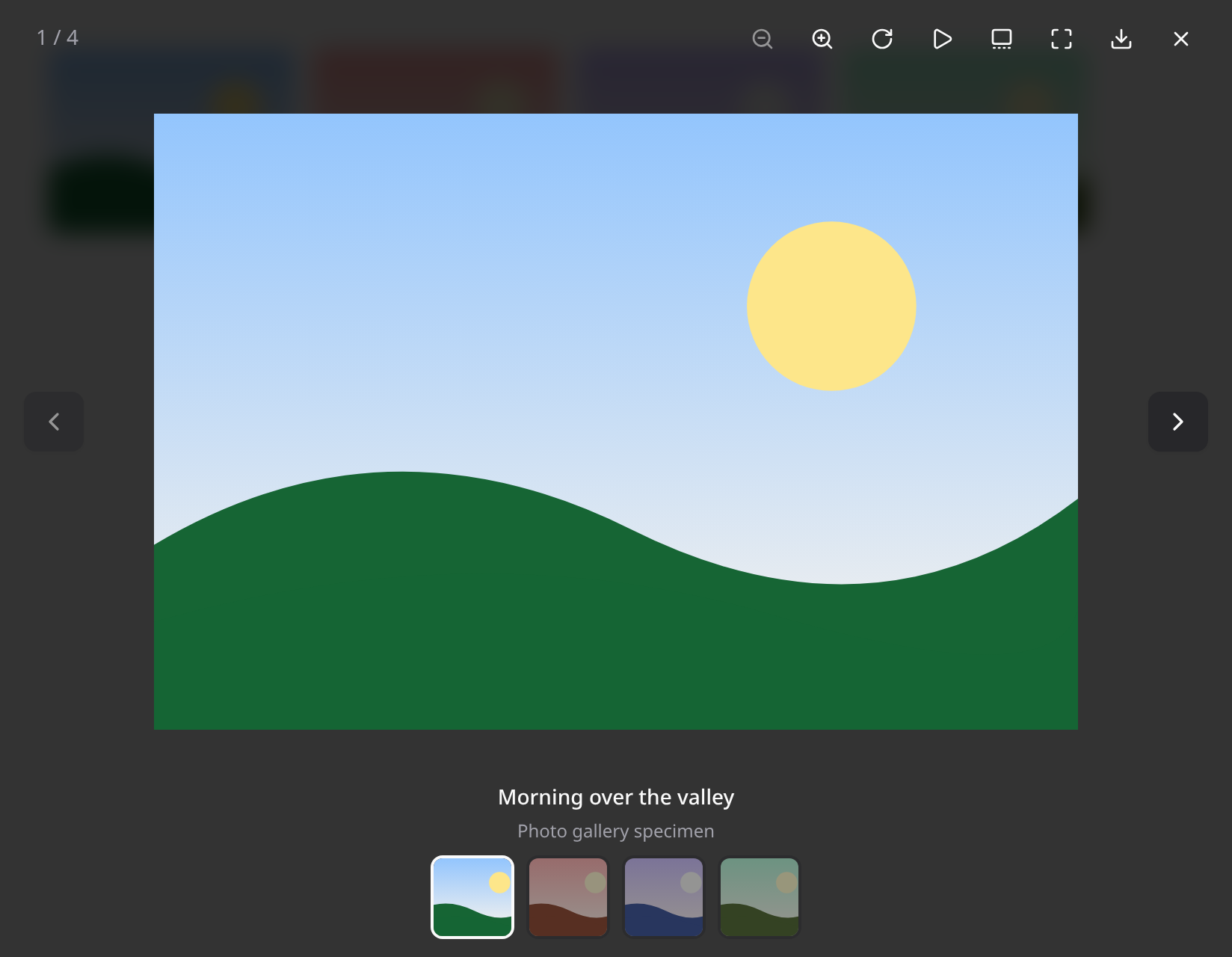
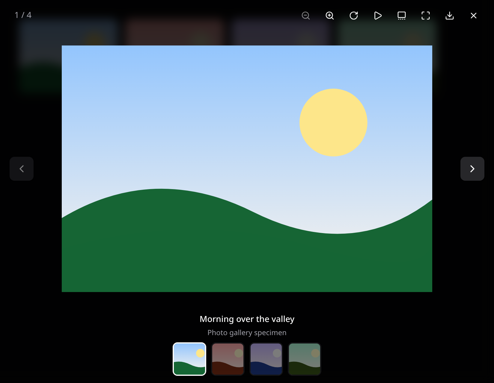
It is wired into everything in Kinetix that shows an image:
| Where | How |
|---|---|
| Help Center and Docs articles | Every image in a Markdown body, as one gallery per article |
ImageColumn | ->preview() — the column's images on the page form a gallery |
ImageEntry | ->preview() — the infolist's previewable images form a gallery |
| Media library | Clicking a tile browses every image in the field |
PreviewAction | Opens the action's URL (image, PDF or download card) |
| Inbox | Image messages |
Mount the host once
<KinetixFilePreview /> hosts one viewer for the whole app. It is already part of the layout snippet in Getting Started; if you skipped it:
<script setup lang="ts">
import KinetixFilePreview from "@/components/kinetix/KinetixFilePreview.vue";
</script>

<template>
  <!-- ...your layout... -->
  <KinetixFilePreview />
</template>
Without a host, a trigger opens its file in a new tab instead of doing nothing.
The host is a small shell: the viewer itself downloads on the first preview. Hovering or focusing a [data-kinetix-lightbox] element starts that download early, so it's usually there before the click. The click is still handled at once, and the viewer opens as soon as it has loaded. Its fullscreen and visibility listeners are only attached after that first open. Add the vite:preloadError handler so a tab opened before a deploy recovers.
App-wide defaults
The host's props are the defaults for every viewer it opens:
<KinetixFilePreview
  loop
  :toolbar="['slideshow', 'zoom', 'rotate', 'fullscreen', 'open', 'download']"
  :thumbnails="false"
  :max-zoom="6"
/>| Prop | Default | |
|---|---|---|
loop | false | Page from the last item to the first and back |
toolbar | ['zoom', 'rotate', 'slideshow', 'thumbnails', 'fullscreen', 'download'] | Buttons, rendered in the order given: zoom, rotate, slideshow, thumbnails, fullscreen, open (new tab), download. Close is always there. A button that doesn't apply is left out (zoom/rotate on a PDF, slideshow or thumbnails with one item); on phones the zoom buttons give way to pinch and double-tap so the bar stays on one row |
thumbnails | 'auto' | Thumbnail strip: auto shows it from 640px up (a toolbar button toggles it on phones), true always, false never |
zoom | true | Zoom and pan images |
maxZoom | 4 | Largest zoom, relative to the fitted image |
closeOnBackdrop | true | Close on a click/tap on the empty space around the item |
swipeToClose | true | Close with a vertical swipe |
animation | 'zoom' | zoom grows images from their thumbnail, fade cross-fades, none is still |
preload | true | Load the neighbours of the current image ahead of time |
slideshowInterval | 4000 | Milliseconds each item shows during a slideshow |
autoplay | false | Start the slideshow when the viewer opens (never under reduced motion) |
bind | true | Open [data-kinetix-lightbox] elements on click (see below) |
Tables and infolists
use Happones\Kinetix\Infolists\Components\ImageEntry;
use Happones\Kinetix\Tables\Columns\ImageColumn;

ImageColumn::make('photo')->preview();                 // one gallery per column, per table
ImageColumn::make('photo')->preview(gallery: false);   // each image on its own

ImageEntry::make('cover')->preview();                  // one gallery per infolist
The thumbnail becomes a button named after the image, so it is reachable with the keyboard.
Markdown images
Images in a <KinetixMarkdownContent> body — help articles, docs pages — open in the lightbox as one gallery per document. The caption comes from the image's <figcaption>, its title () or its alt text. Images inside a link keep the link.
It is on by default. Turn it off for the whole app in config/kinetix.php (or with KINETIX_LIGHTBOX_MARKDOWN=false):
'lightbox' => [
    'markdown' => false,
],
The lightbox prop overrides the config either way, on <KinetixMarkdownContent>, <KinetixHelpArticle> and <KinetixDocs>:
<KinetixHelpArticle :slug="slug" :lightbox="false" />
<KinetixDocs :docs="docs" lightbox />
In your own components
<KinetixLightboxImage>
A thumbnail that opens in the lightbox. Thumbnails sharing a group browse as one gallery, in page order:
<script setup lang="ts">
import KinetixLightboxImage from "@/components/kinetix/KinetixLightboxImage.vue";
</script>

<template>
  <div class="grid grid-cols-2 gap-3 sm:grid-cols-4">
    <KinetixLightboxImage
      v-for="photo in photos"
      :key="photo.id"
      :src="photo.url"
      :thumbnail="photo.thumb_url"
      :alt="photo.alt"
      :caption="photo.title"
      group="property"
      img-class="aspect-[4/3] w-full"
    />
  </div>
</template>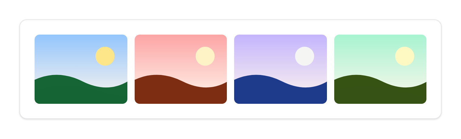
| Prop | |
|---|---|
src | The full-size file |
thumbnail | What the trigger and the thumbnail strip show (defaults to src) |
alt, caption, description | Alt text, and the caption under the image |
downloadUrl | Download target (defaults to src); false hides the button |
type | image (default), pdf, other or auto |
group | Gallery name; empty opens the image on its own |
scope | Selector of the ancestor a group is collected in (scope="table" keeps two tables apart) |
circular, imgClass | Shape and classes of the default thumbnail |
options | Viewer options for this opening, over the host's defaults |
The default slot replaces the thumbnail markup.
Plain markup
With the host mounted, any element with data-kinetix-lightbox opens on click, grouped by the attribute's value. The full file comes from data-src or href; the inner <img> gives the thumbnail and alt text; data-caption, data-description, data-type and data-download-url fill the rest:
<a href="/photos/1.jpg" data-kinetix-lightbox="trip" data-caption="Day one">
  <img src="/photos/1-sm.jpg" alt="Beach at sunrise" />
</a>
Groups are collected inside the closest [data-kinetix-lightbox-scope], or the whole page. A click with a modifier key (to open in a new tab) is left alone.
From script
import { openKinetixLightbox } from "@/composables/useKinetixLightbox";

openKinetixLightbox(
  [
    { url: "/a.jpg", caption: "Front" },
    { url: "/b.jpg", caption: "Back" },
    { url: "/manual.pdf", caption: "Manual" },
  ],
  { index: 1, options: { loop: true } },
);
An item is { url, type?, thumbnail?, alt?, caption?, description?, downloadUrl?, downloadLabel?, origin? }. origin is the element it opens from — the image zooms out of it and back into it. The same shape travels on the kinetix:preview window event (items, index, options), which still accepts the single-file { url, type, label } shape.
A viewer of your own
<KinetixLightbox> is the controlled viewer the host uses; mount it directly to own its state:
<KinetixLightbox v-model:open="open" v-model:index="index" :items="items" loop>
  <template #caption="{ item }">
    <p class="text-sm font-medium">{{ item.caption }}</p>
  </template>
  <template #actions="{ item }">
    <!-- extra toolbar buttons -->
  </template>
</KinetixLightbox>
It takes the same options as the host, plus title (the accessible name when an item has none), and emits change(index, item).
Importing KinetixLightbox directly puts the whole viewer in that component's chunk. Do it in the page that owns the viewer, not in a layout, or every page pays for it (see Performance).
Keyboard and gestures
← / → | Previous / next |
Home / End | First / last |
+ / - / 0 | Zoom in / out / back to fit |
r / Shift+R | Rotate clockwise / counter-clockwise |
Esc | Close (focus returns to the thumbnail) |
| Wheel, pinch, double-click/tap | Zoom around the pointer |
| Drag a zoomed image | Pan |
| Swipe sideways / down | Page / close |
Rotate
The rotate button (or r) turns the image a quarter clockwise and refits it, so a landscape photo turned upright still fits the screen; zoom and pan keep working at any angle. The next item starts upright. Rotation only changes the view — the download is the original file.
Slideshow
The play button advances every slideshowInterval ms with a progress bar under the toolbar, wrapping from the last item to the first. Paging by hand restarts the countdown, a drag holds it, zooming in stops it, and it pauses while the tab is hidden. autoplay starts it on open, except for users who asked for reduced motion. The slideshow doesn't announce every slide to screen readers; the pause button is always there.
The viewer is a dialog: focus stays inside while it is open, every button has a translated name, the position ("2 of 5") is announced when it changes, and the current thumbnail is marked with aria-current and a border. Under reduced motion (the OS setting, the accessibility menu or kinetix.motion) nothing animates.
The viewer is always dark: it scopes your theme's dark tokens to itself, so its controls use your own colors in either mode.